Background
After my second interview with the Harmony Venture Labs design team, I was given this UX design challenge, which took me about 5 hours to complete.
Problem & Challenge
The creators of a mobile app, which allows you to travel to any time in the past or the future, wants to implement a recommendations feature that helps users pick a fun time in the future or past to visit.

Design a new feature in our time travel app that provides users with recommendations for places in time to travel to.
Opportunities for this feature include but are not limited to: upselling guided tour packages and filtering.
Challenge Accepted
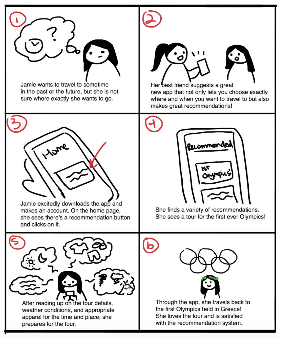
Storyboarding
Before I proposed designs, I created a storyboard to explore a potential user situation in which they would need a recommendation feature for time traveling. So, I created a storyboard illustrating when a user, Jamie, is not sure on when and where they want to time travel back to, thus relying on the app’s recommendation system to help them.
Sketching
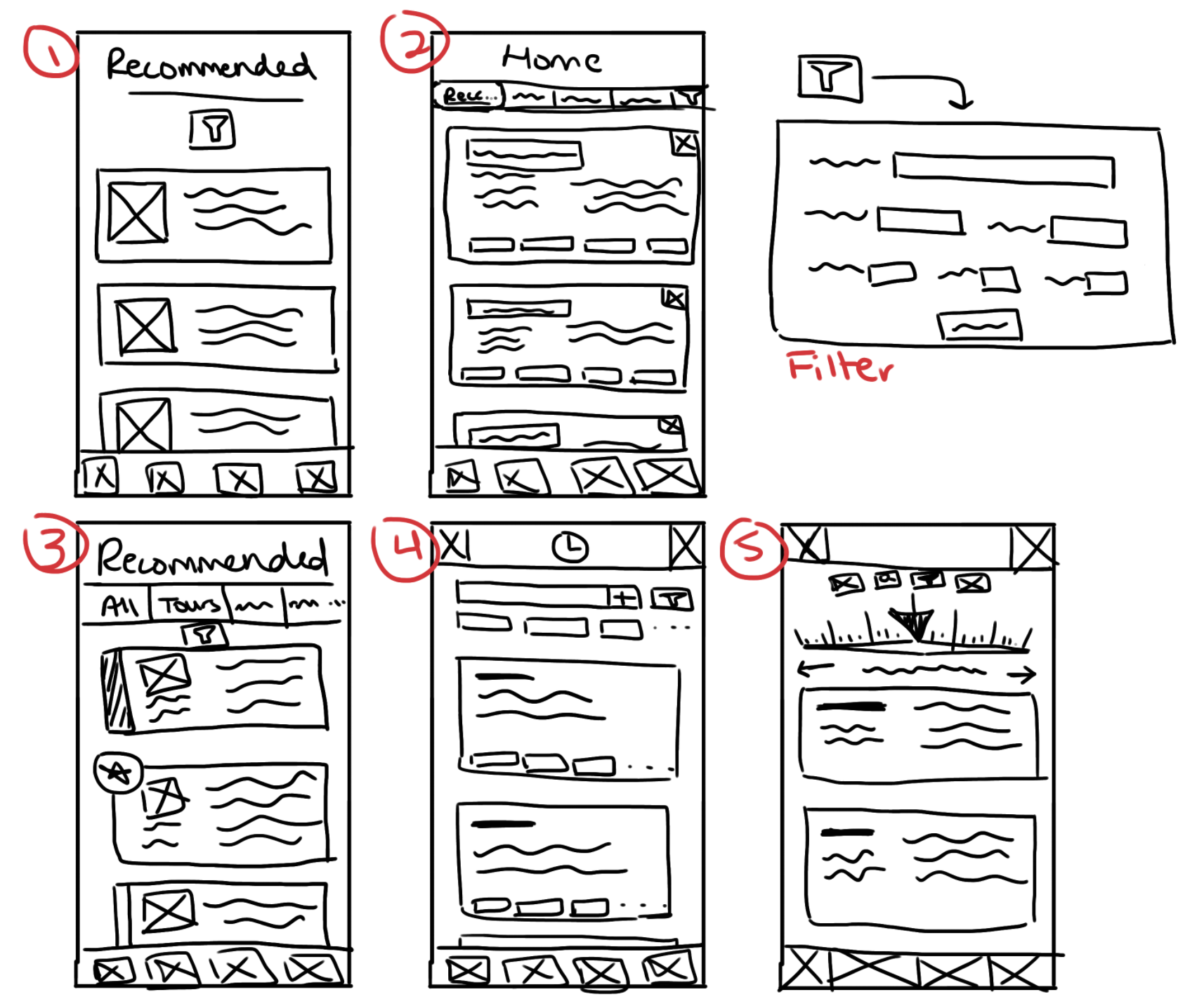
Next, I created some rough sketches to generate ideas for the layout of the recommendation feature.
I drew inspiration for these sketches from existing platforms, like Twitter, whose recommendation page divides content by certain categories: For You, Trending, News, etc. I used a similar style for some of these sketches (sketches 2 and 4), but these categories would likely include: All, Tours, Past, Future, etc.
All sketches also have an additional sorting/filter feature (shown on the top right) for more specific searches. This feature would likely be a dropdown where users can input the parameters they want to filter by.
Wireframing
With some ideas sketched out, I narrowed down and combined the most intuitive features. I used Figma to create some grayscale wireframes.
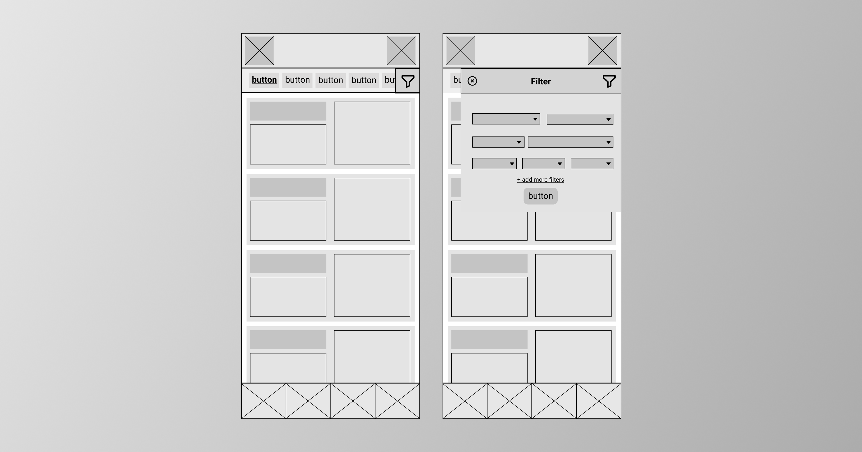
For this wireframe, the suggested times and places populate the majority of the feed. There are several buttons near the top of the app that let users perform quick filtering. The default category would be a general recommendation “For You” page, Users can also explore other categories or tap the filter button on the top-right side to have more fine-tuned recommendations (which would work on any tab).
After wireframes, some user testing would be beneficial. I would create some paper prototypes to test with some users. Testers would be given some tasks to navigate through the app. Their feedback would help me as I move into the next stages of the design process.
The Final Stages
Mockup Iteration 1 - Grayscale
For my first mockup, I laid it out in grayscale. You can view and click through the mockup here. I screenshot the pages for an easier viewing of all the pages.
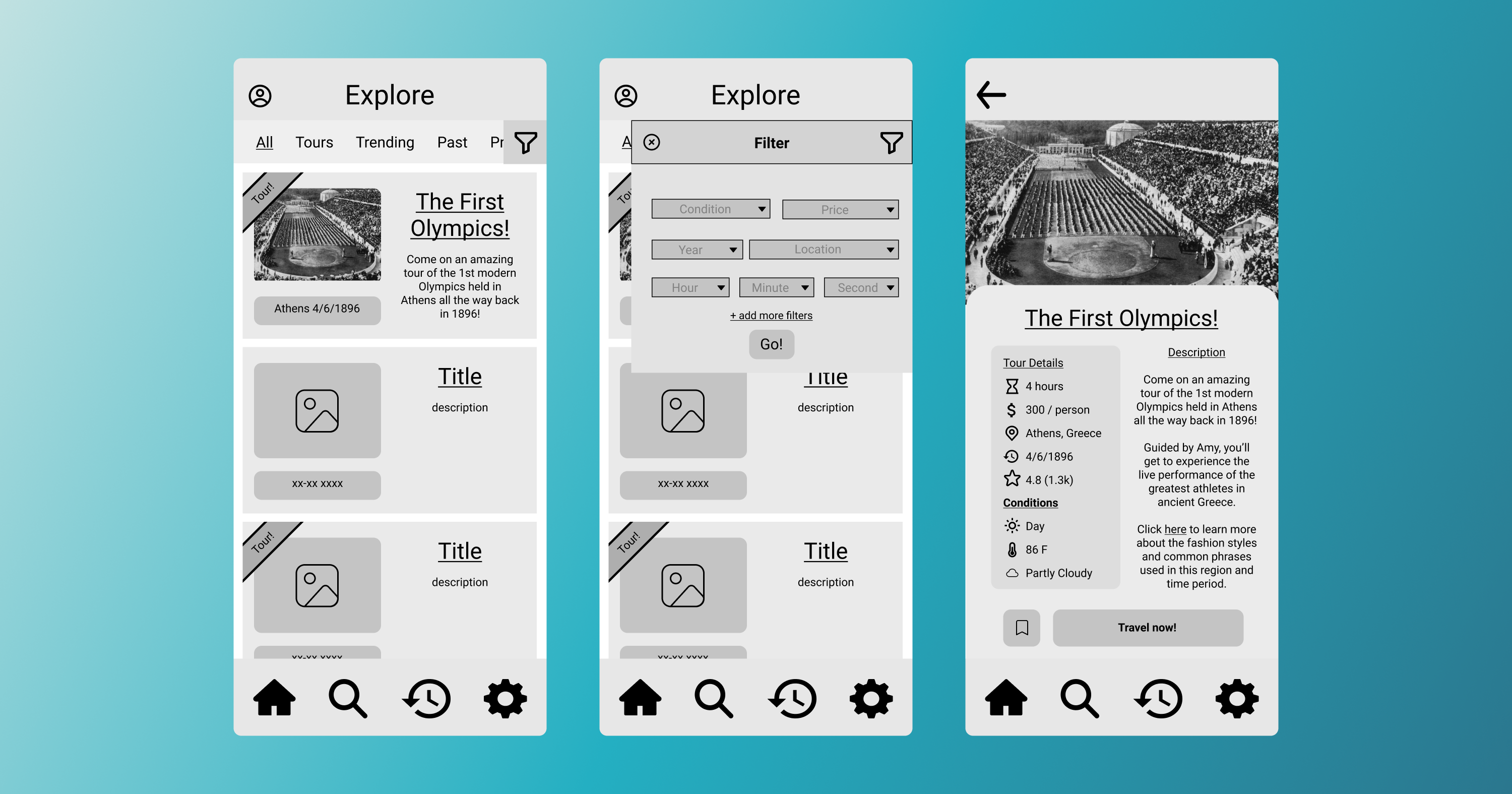
In this iteration, I added appropriate icons and text. “Tours” are set apart from other recommendations with a banner on the top left corner of each card. This way, the user's attentions are drawn to Tours. I also created the page where the details of the recommendation event are displayed (labeled “Mockup Page” on the top right). This page includes several useful details: tour duration, price, weather conditions, ratings, links to helpful fashion resources, and more. The main feed, in any category, also allows users to filter with more specific parameters if they choose to.
Mockup Iteration 2 - Color
For the next iteration, I added color and touched up some features. You can view and click through the mockup here.
First, I wanted to create a color palette that I used to help me keep consistency across this recommendation feature.
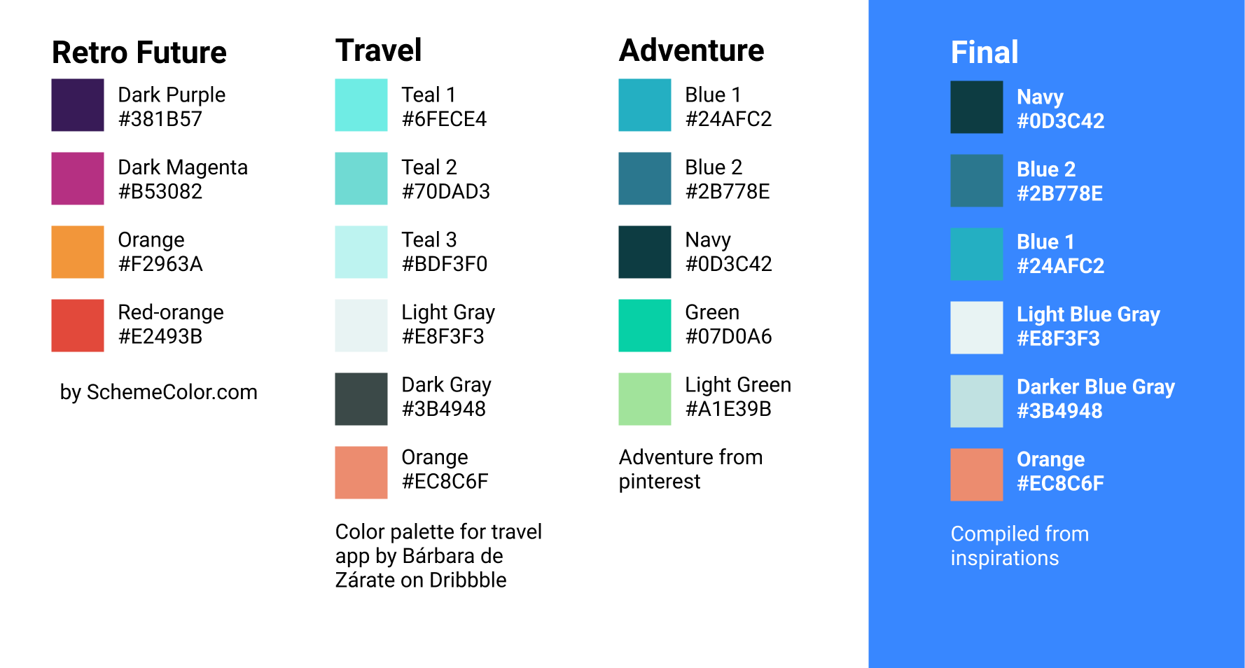
I settled on these colors (labeled “Final”, found on the far right), because I drew inspiration from some aesthetics of travel apps and color palettes of “adventure”. I originally considered “Retro Future” colors, but I decided that the Travel and Adventure theme is what I want to promote.
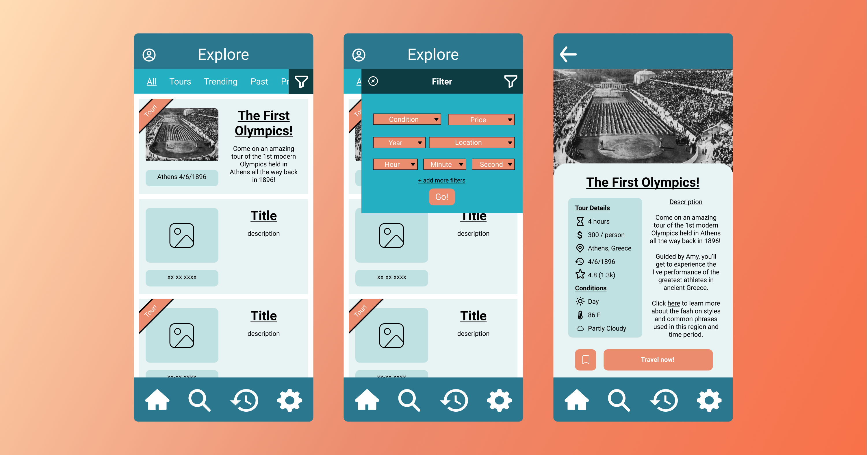
In this iteration, orange was used to draw users’ attention as it is complementary to the generally blue layout. The Tour recommendations are further highlighted by the orange banners. I made certain text and icons white in order for them to stand out against the dark blue background.
User Testing and Further Iterating
At this stage, I would create a test protocol and proceed to test all aspects of this proposed feature. The test protocol would involve the tester thinking aloud as they do each action. This way, I will be able to know what users are thinking as they navigate the app using the feature. After each interview/test, I would analyze the responses and improve the prototype for the next iteration. In addition, I would continue to fine-tune the aesthetics to make sure they stay consistent with the rest of the app’s design.
Reflection
Perhaps with more time, I would have pursued more steps in the design process. Testing and collaborative input would help to improve the design, as these current iterations only consist of my perspective. In addition, there are features I would have implemented: making a functional filter (both general and specific), populating the recommendation content, and more.
Overall, the challenge was very fun! It tested my abilities to step through the design process without a team, and I learned some new functionalities in Figma. If there are any questions about my design choices and inspirations, please let me know!