The Distracted Driving Experience for Fleet Drivers
Sponsored Project with Verizon Connect


Tasked with exploring the “just right” experience for fleet drivers, my team and I employed various methods of research on how drivers navigate distractions inside and outside the cabin. Distractions come in many forms: texting while driving, lane departures, surrounding traffic. Existing fleet management systems, like Verizon Connect’s Reveal, aim to warn fleet drivers of distractions while also allowing managers to monitor and track their fleets. Our research in this project informed the user needs and design directions needed to create a physical prototype that improves the current Reveal system to aid fleet drivers as they are working.
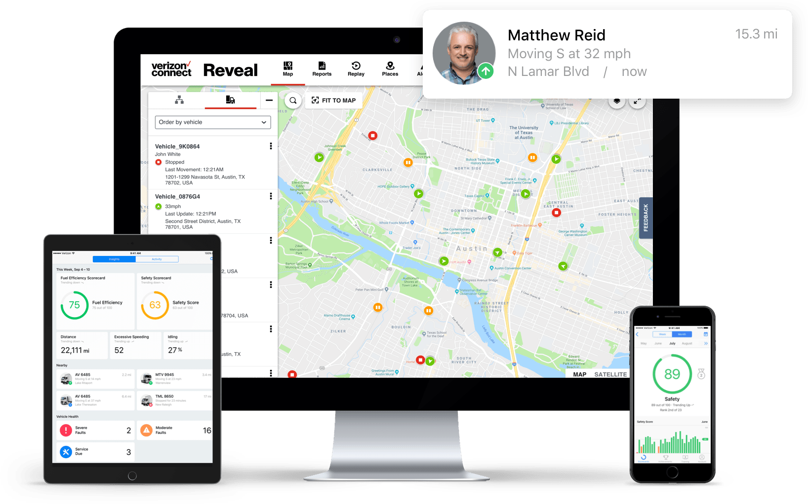
What is Reveal?
Reveal is a B2B fleet-tracking tool that makes use of a variety of in-cabin hardware, including: cameras, vehicle tracking devices, electronic logging devices, and in-cabin monitors.
Parts of a Fleet Tracking System
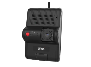
Hardware
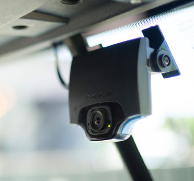
Driver-Facing Camera
Road-Facing Camera
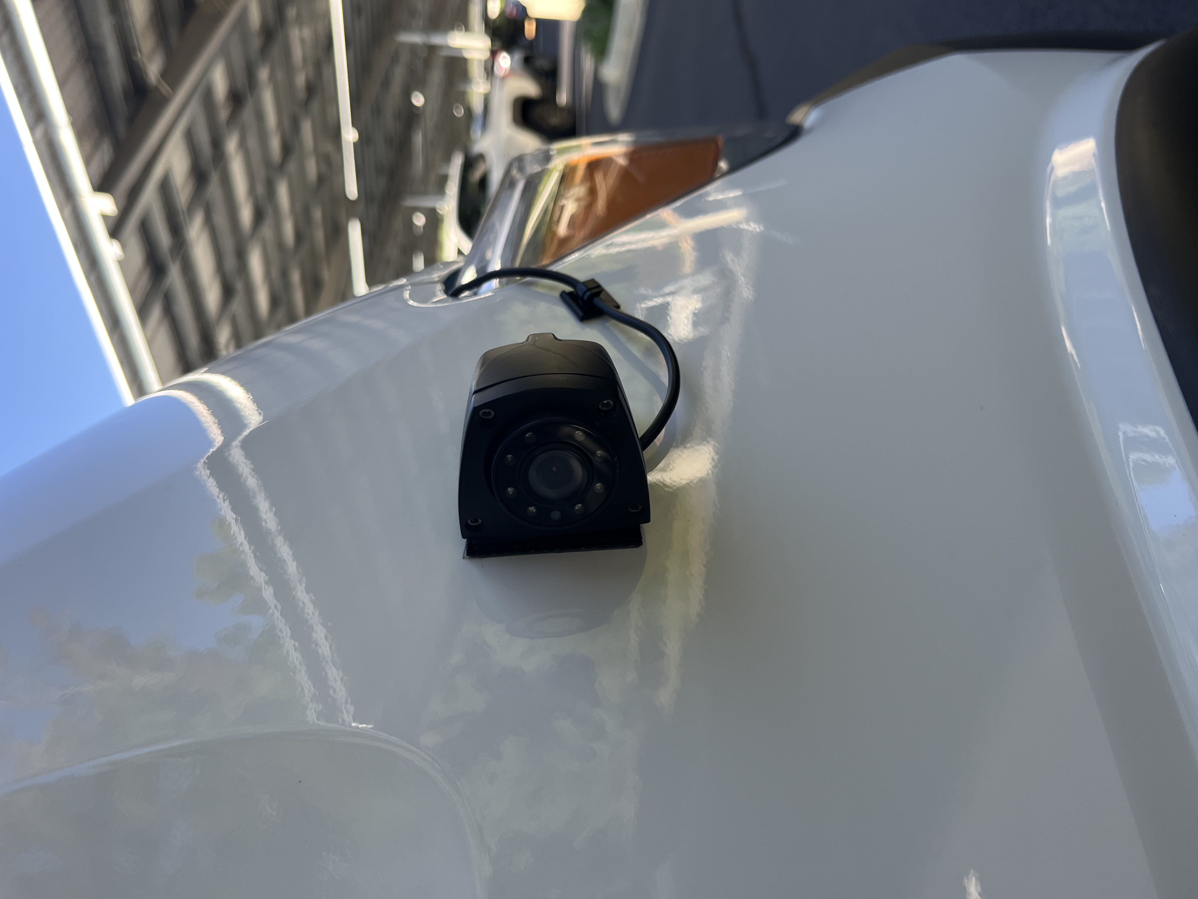
Extended-View Cameras
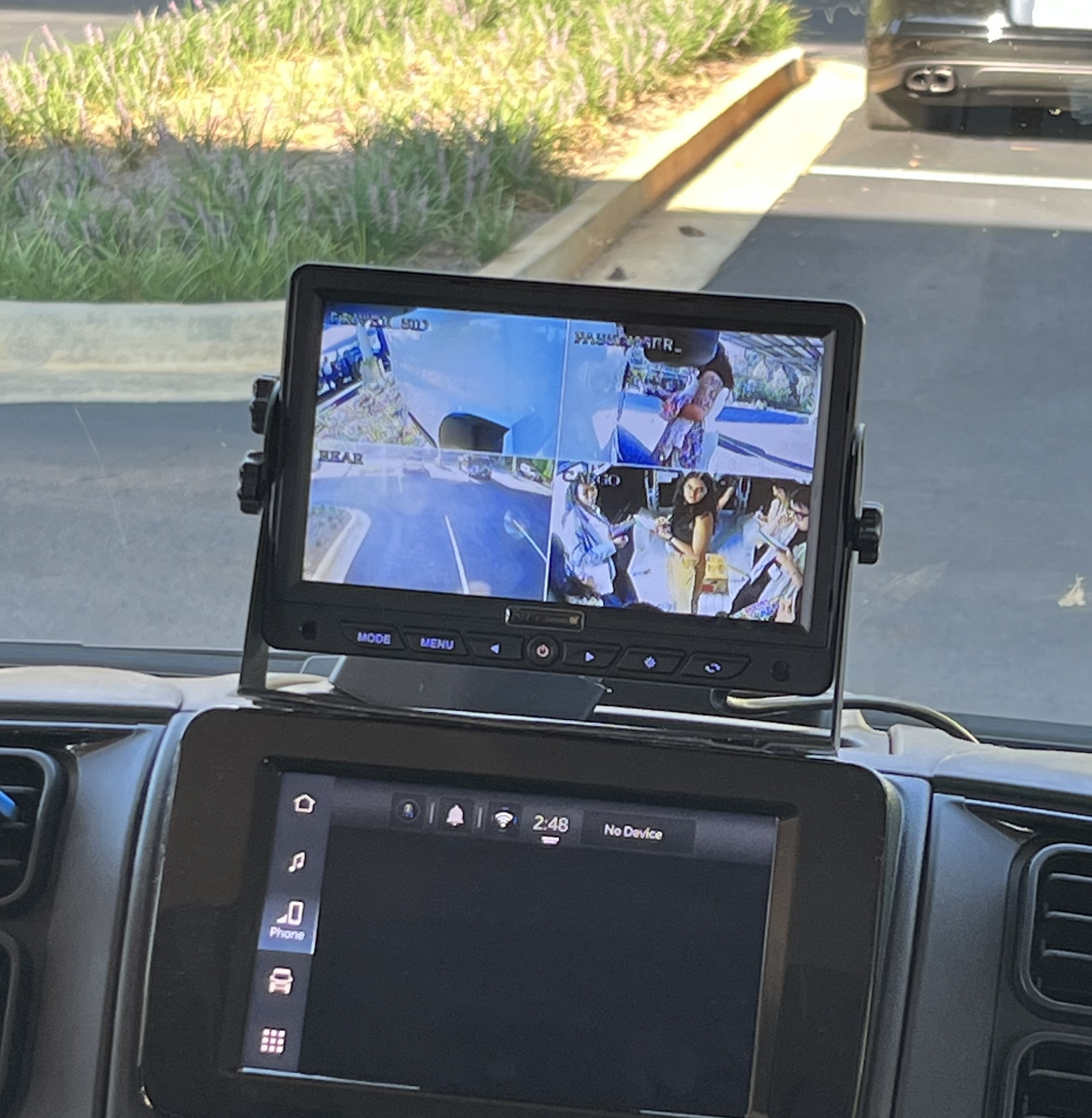
Dashboard Tablet
Other Hardware
- Accelerometer
- Speedometer
- Trackers
Digital & Algorithms
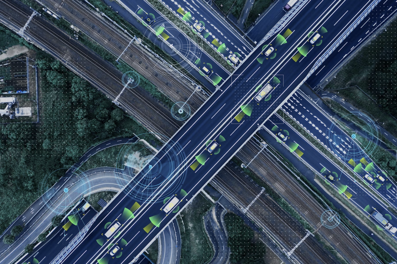
Advanced Driver Assistance Systems (ADAS)
Also known as ADAS, these assistance systems help with a variety of tasks, like detecting internal or external dangers and assist in controlled and safe driving. For some of its more apparent features, think of modern cars having sensors for blind spot detection, emergency braking, etc.
Improved AI detection helps with flagging and sending alerts to the manager, through the online dashboard, and the driver, through visual and/or audio alerts.
Read more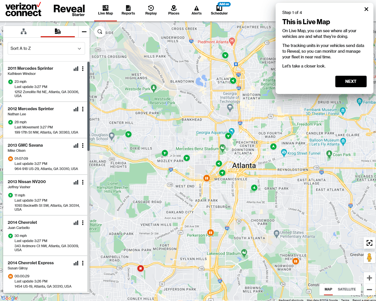
Online Dashboard
The online platform provided by Reveal consists of several tabs, where you can navigate to live maps of fleet vehicles' status, history, and live location. Statistic reports and video recordings are also other features.
The Fleet Management Industry
Let’s take a look at the background and outlooks of the fleet management system industry.
Stakeholders
The primary stakeholders of Reveal are the fleet managers, who purchase and have the systems installed in the fleet vehicles.
Our focus was on the fleet drivers, who actively interact and receive audio feedback from the fleet management system device in-cabin.
Market
According to a 2024 study by Global Market Insights, fleet management systems are valued at about 23.4 billion USD and shows projected growth with a 16% CAGR and an estimated global market value of 97.6 billion USD by 2034.
Benefits
Safer Driving: With advanced and improved AI detection, drivers can be adequately warned against distractive behaviors and surroundings.
Tracking: Managers can track past and present locations, driving statistics, and triggered alerts.
Litigation: When accidents occur, recorded footage from the system’s cameras can be used as evidence, often times taking the blame off the fleet drivers.
Distracted Driving Impacts
Most have heard of the term "distracted driving", but there's more to it than just someone texting while driving.
Driving distracted causes accidents.
For fleet truck drivers, some accidents can be caused by in-cabin distractions. For example, a long-haul driver might experience fatigue after their long shift, resulting in slower reaction times and increased cognitive overload.
In addition, factors like delivery punctuality and economic pressure to keep their jobs might contribute to behaviors like speeding.
They might also engage in other behaviors that take their hands off the wheel or eyes off the road, like smoking or phone use.
So with the advanced systems of fleet management systems, our project aims to better understand distracted driving habits. Therefore, we continued to the next stages of the project with this problem statement.
PROBLEM STATEMENT
How might we improve the in-cabin experience of fleet drivers to minimize distracted driving?
Into the Field
After conducting our initial background research, we established a few research questions to guide the next stage.
- What are drivers’ distractions in-cabin? External? Internal?
- How do we balance between the manager's stakeholder interests and the drivers’ safety & comfort?
- What are drivers’ distracted driving behaviors?
- How can we minimize alert distractions? What software and hardware can we improve on? Does any new technology need to be adapted? Any new mediums of interactions?
To answer these questions, we conducted 4 main methods of research: an on-site hardware walkthrough, semi-structured interviews, surveys, and a competitive analysis.
1. On-Site Visit & Hardware Walkthrough at Verizon Connect
In coordination with one of our mentors, my team visited the Verizon Connect office in Alpharetta.
My Role
- Observe, ask questions, and take notes on software and hardware demos from the Verizon Connect testing crew
Goals
- Examine, test, and observe the applications and hardware in real-world settings
- Understand how each hardware component works, installation, and system behavior in context
- Gather quantitative data on system complexity for potential pain and friction points
Procedure
- Receive debriefing from the Verizon Connect team on how the system works with an online platform demo
- Examine Reveal’s hardware cameras on different vehicles and positions
- Ask testing crew and drivers follow-up questions
- Constraints: Only allows us to learn from some stakeholders and product testing crews
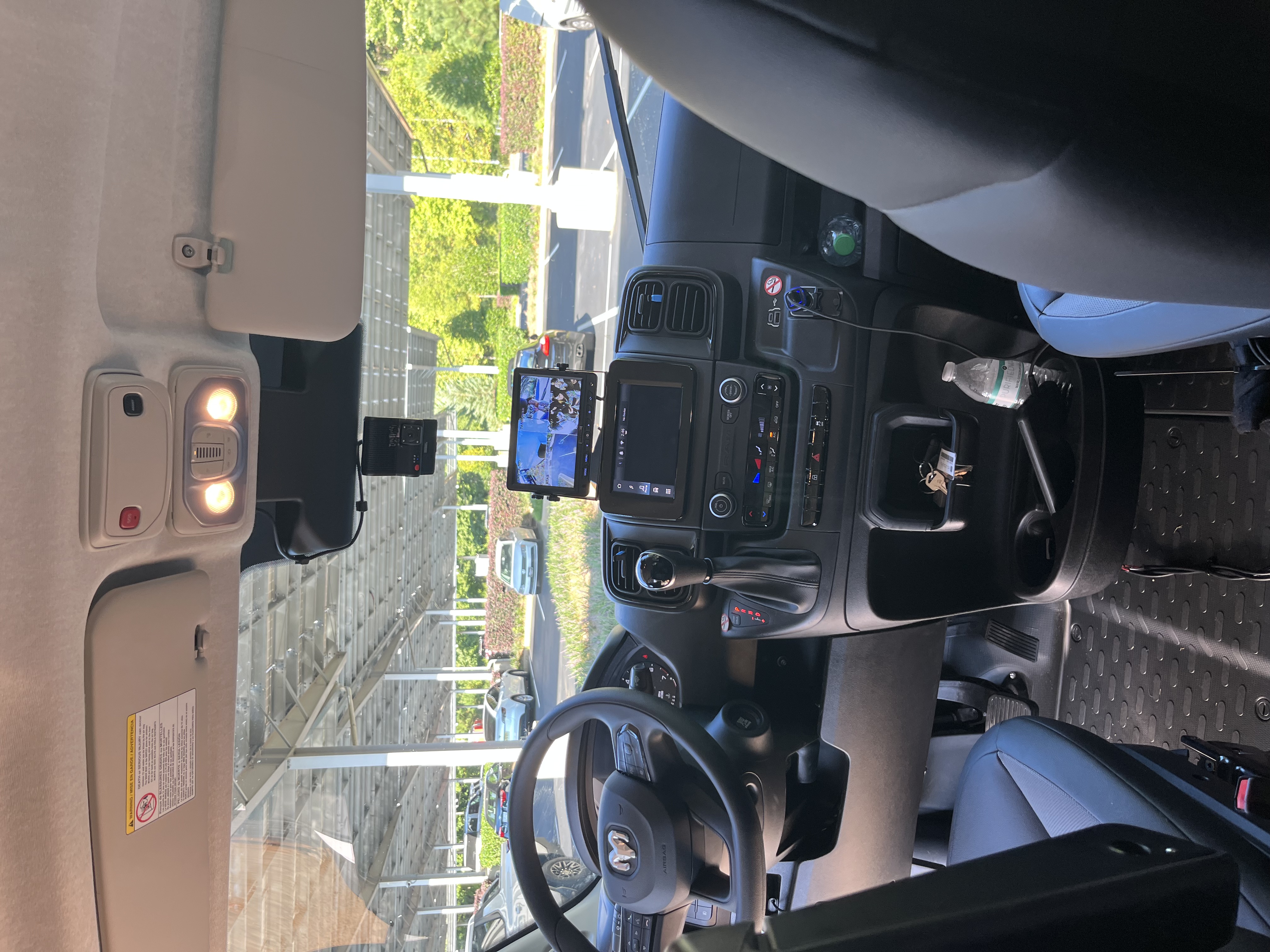
Findings
- Drivers have difficulty hearing the safety/distraction alerts due to in-cabin noise & sounds in their environments
- Drivers are often distracted by frequent repetition of alerts and false alarms triggered by inaccurate AI detection
- Drivers are concerned about their privacy being invaded by driver-facing cameras
2. Semi-structured Interviews
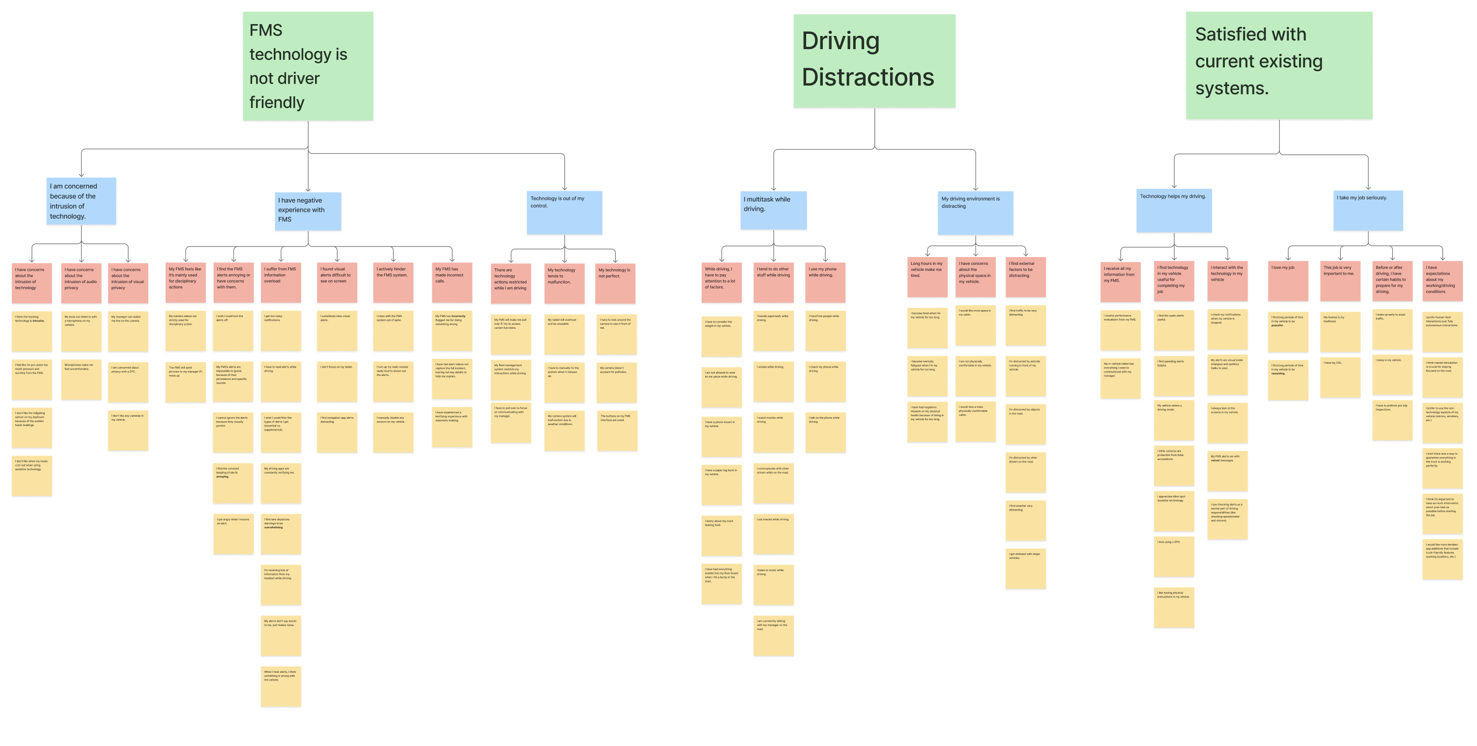
This study was a qualitative method where we wanted to learn about fleet drivers and their habits. We interviewed 9 drivers.
My Role
- Led 2 interviews and took notes for 4 sessions, approved interviewees
- Collaborated in the creation and editing of the interview protocol
- Organized and analyzed through affinity mapping
Goals
- Learn about driver habits, distractions, and opinions towards topics related to fleet management systems
- Gain insight to what the job of trucking entails
Procedure
- Recruited and screened on userinterviews.com, then met with participants on Google Meet, paid them $100 compensation for 1h session
- 9 participants, full-time fleet drivers, qualified by screeners
- Semi-structured, experience-based sessions surrounding emotional and behavioral insights
- Explored driving habits, multitasking, safety perceptions, frustrations with fleet management systems
- Affinity diagramming to analyze & present data
- Constraint: Aside from not being able to see them actually on the job they might be hesitant to admit to doing imperfect driving habits
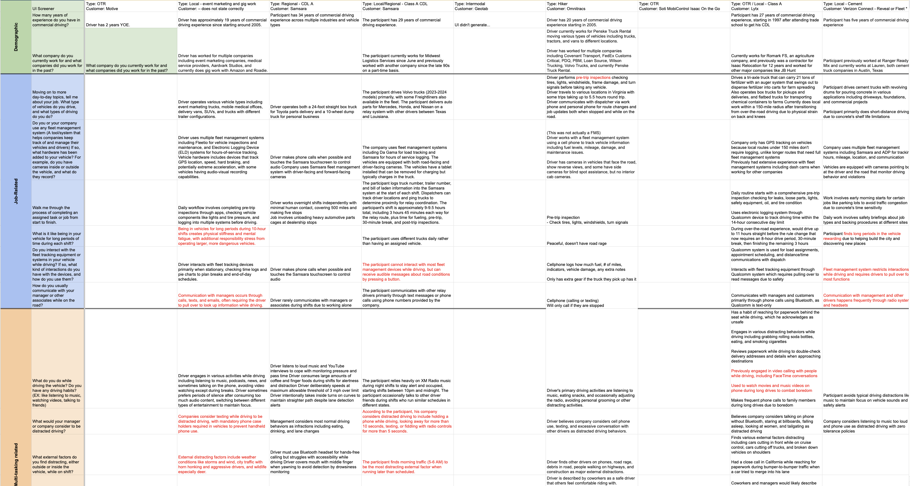
Findings
- Alerts from the system cause information overload, but are helpful reminders in the long run
- Some drivers had imperfect driving habits, like using their phone while driving
- Drivers feel like these systems are scrutinizing, intrusive, distractions, and don’t always capture the extended context
3. Surveys
To gather some quantitative data from our target audience, we sent out online surveys via the platform userinterviews.com. We received 76 valid survey responses.
My Role
- Brainstorm, created, and edited survey questions
- Collaboratin on coding and monitoring survey responses and participants
Goals
- Qualitative and quantitative data on driver equipment and attitudes
- Identify direct trends of distracted driving behavior, current solutions, satisfactions and frustrations
Procedure
- Recruited from userinterviews.com, $15 compensation
- Once approved and screened, participants completed a Qualtrics survey
- Screener to ensure they are full-time fleet drivers that can provide valid responses of current equipment
- 208 applicants, 76 valid responses
- Completion time on average was less than 10 minutes
- Used R to conduct statistical analysis (mean, sd, variance)
- Constraint: There could be some response bias, and during the process, we detected a few scammers trying to access our survey
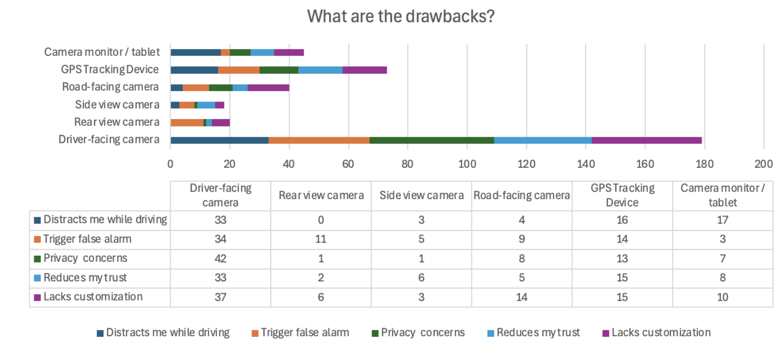
Findings
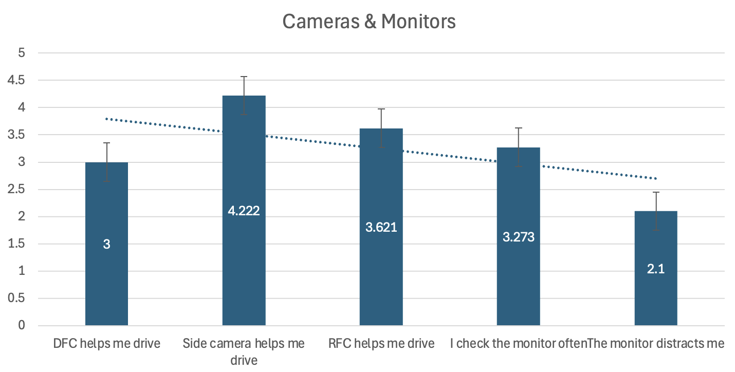
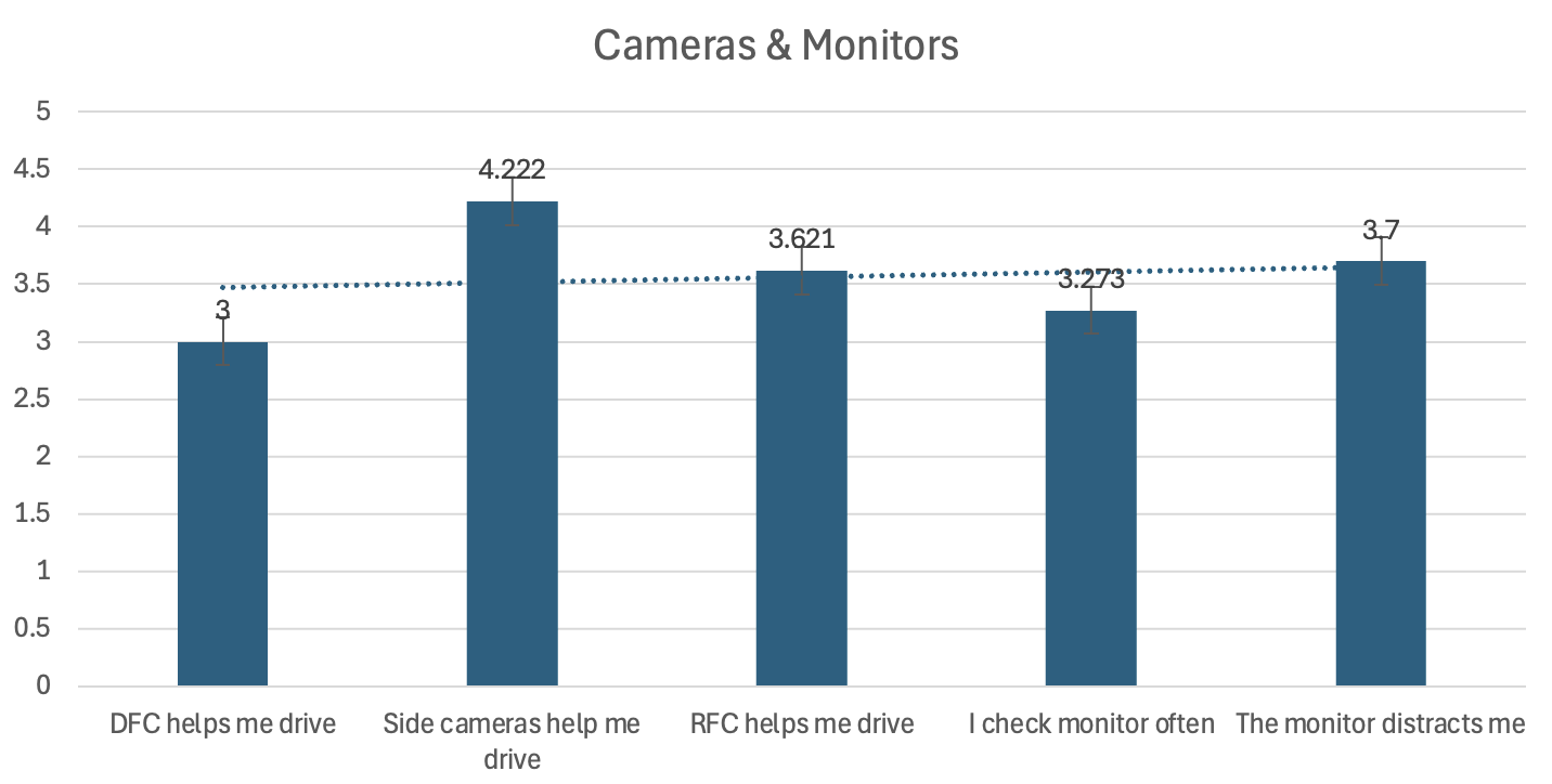
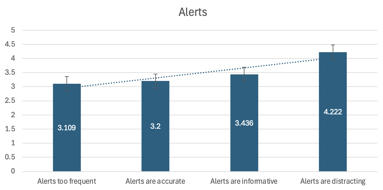
- Drivers are most uncomfortable with driver-facing cameras
- Driver-facing cameras have the most drawbacks, including privacy intrusion, false alarm, trust issues, lack of customization, and are distracting
- Road and rear view cameras are the most helpful
- Alerts are more distracting rather than accurate or helpful
4. Competitive Analysis
Lastly, we gathered some data about competitors, what features stood out and were standard in the fleet management industry. These advantages and disadvantages from other products could show what would may help drivers as they work.
My Role
- Research and gathered information on specific competitor features and metrics
Goals
- Assess strengths & weaknesses across fleet management system competitors
- Identify gaps in driver-friendliness, privacy features, control over hardware
Procedure
- Each team member analyzed a competitor based on the set metrics (Geotab, Lytx, Omnitracs, Samsara)
- Organized information in a Google Sheet
- Reviewed the data that we gathered as a team
- Constraint: For some competitors, it was more difficult to directly access their product for comparison
Findings
- Competitors have reward systems for drivers
- The target audience for fleet management systems is fleet managers, not drivers
- Some systems have "privacy modes", but it's usually a cosmetic fix (a camera cap)
- Reveal lacks giving driver control of the hardware, compared to some other competitors
Research Findings & User Needs
From our research, we analyzed the data and found common themes on what the users, the fleet drivers, need when they are driving and interacting with the fleet management systems.
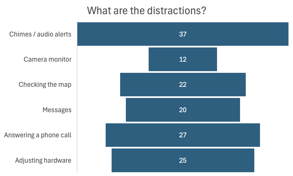
We found that a big point made by many drivers was that the alert system was often more distracting than it was helpful. These alerts come through the systems built-in audio system, but the alerts that chime are described as many times being uninformative, too loud, or too repetitive. In the cases of repetitiveness, drivers felt especially annoyed when they were false alerts, errors from the detection system. They felt that they had no control over the system, even in the events of these technical failures. Most of the drivers we interviewed took their jobs extremely seriously, detailing how they are under strict regulations on their driving habits, so having these added in-cabin issues can lead to further distraction.
From the data across our research, we created a list of user needs. To summarize, drivers need to stay focused on driving without being distracted and have system alerts clearly, concisely, and effectively communicated to them either verbally or visually. By doing so, drivers can feel more confident and safe, knowing that they will be adequately warned about their surroundings while they are working. However, they should also feel confident that in cases that the system fails, they have a way to take some control over the problem. Like some of our interviewees stated, they should not be burdened with false alerts or audio alerts that chime so loud and often that they get headaches.
Design Implications
These research findings and established user needs guided the following design directions needed for the next steps.
1.
The design should provide concise and intuitive fleet management system alert messages to ensure drivers can understand them easily and without great effort.
2.
Chimes and audio alerts should provide drivers with clear and non-repetitive information to increase their safety confidence while not causing confusion and frustration.
3.
The design should balance between ensuring driver safety, optimizing driving experience, and helping companies’ management. The design should provide control over volume for people with increased or decreased hearing abilities.
4.
The design should give users direct control over the FMS so they can deal with false alarms or cognitive overload quickly.
5.
The design should enable the users to monitor road conditions, blind spots, and their surrounding traffic for driver safety.
6.
Driver-facing cameras should increase their situational awareness while preventing them from distracting behaviors.
Putting Pen to Paper: Ideation
With our initial research and design directions established, we moved into ideation. Our team separately brainstormed ideas and then created sketches. We came together and shared our different concepts and features: ranging from tablet-based operations, physical buttons, touchscreens, and voice assistance.
My storyboard on a driver's negative experience with alerts, causing annoyance, information overload, and distracted driving
Sketching
We created a total of four sketches, where I created one. We all coincidentally ideated on some type of physical product, rather than a purely digital option involving the existing Reveal online platform.
My Sketch: Touchscreen Control & Display
I created this sketch where the system is centralized to a tablet that is attached to the driver’s dashboard. The tablet is touchscreen and displays relevant information, namely alerts and other statistics. At the bottom, there are touchscreen controls for volume and alert clearing. Note that volume can be raised or lowered, but not muted, as to prevent drivers from clicking that button, forgetting, and then not being able to hear the rest of the alerts playing. Especially for people with decreased or increased hearing capabilities, they can adjust the volume to their preference, but the visual alerts also assist in gathering information.
Audio Initiated Assistance
The driver can have an active verbal conversation with their system through a voice assistant, to receive information and address alerts. The system can also provide help like resolving issues or providing suggestions based on the type of alerts detected. Other features like routing and messaging managers are also provided.

Tablet Display & Physical Buttons
A tablet contains multiple features and is located on the dashboard, where it has buttons placed below the screen (which is not touchscreen like my sketch). The button on the left is a snooze button for muting alerts for 15 seconds, while the right button is a volume control knob for audio alerts. An audio assistance feature allows drivers to report any false alerts. Lastly, when a potential danger appears, like another vehicle is coming too close on the side of their truck, the system will warn the driver with audio alerts and enhanced footage.
Wheel Button Alert Resolution
This sketch tries to minimize interactions with any dashboard tablets, keeping their hands on the wheel, by having a button attached to the steering wheel that can resolve alerts. In cases where the alerts are too repetitive, the driver can temporarily mute them, so that they won’t have added distractions, especially when they’re trying to make decisions in stressful situations.
Revisions & Feedback
Once we had finalized sketches, we organized a couple sessions to gather feedback, one with a fleet driver and the other with the Verizon Connect team, consisting of various types of roles like product managers, UX researchers and designers, and marketing. These diverse perspectives allowed us to gain insights from field experts and stakeholder values.
Fleet Driver Feedback Session
We recruited and conducted the session with our participant similar to our interview process: userinterviews.com and Google Meet. Verified during screening, our participant is a full-time fleet driver that has a fleet management system with cameras and target devices, like driver-facing cameras alerts alerts in his vehicle.
After given an explanation of each of our 4 sketches, the participant was asked for immediate thoughts and opinions on the ideas: places where the system fails or succeeds when they think about how it would apply to their in-cabin experience. Other questions like accessiblity or intuitivity in terms of visual, audio, or physical limitations while driving were also asked, especially after all sketches were explained and they were asked to compare the features against each other.
My role in this step was to draft the sketch feedback session protocol. I was not able to attend the session, but I thoroughly discussed the findings with my teammates afterwards.
Verizon Connect Critique Session
We held a design critique session with 11 Verizon Connect members, including Product managers, UX designers, UX researchers, and directors. At the beginning, we introduced our problem space and explained the sketch feedback procedure.
Then for each sketch, we used 2 minutes to explain the idea and then gave 5 minutes for people giving critiques to use FigJam sticky notes to provide written feedback next to the sketches. We asked them to provide feedback for feasibility, additional features, usability, usefulness, business insights, and stakeholder interests and conflicts. At the end, we asked them place votes per sketch based on four of our metrics: useful, feasible, intuitive, and accessible.
My role at this step was to help prepare the FigJam for the critique session, make slide deck, set up feedback procedures and logistics. During the session, I helped present the background and my sketch and facilitate the session through timing the different sections.
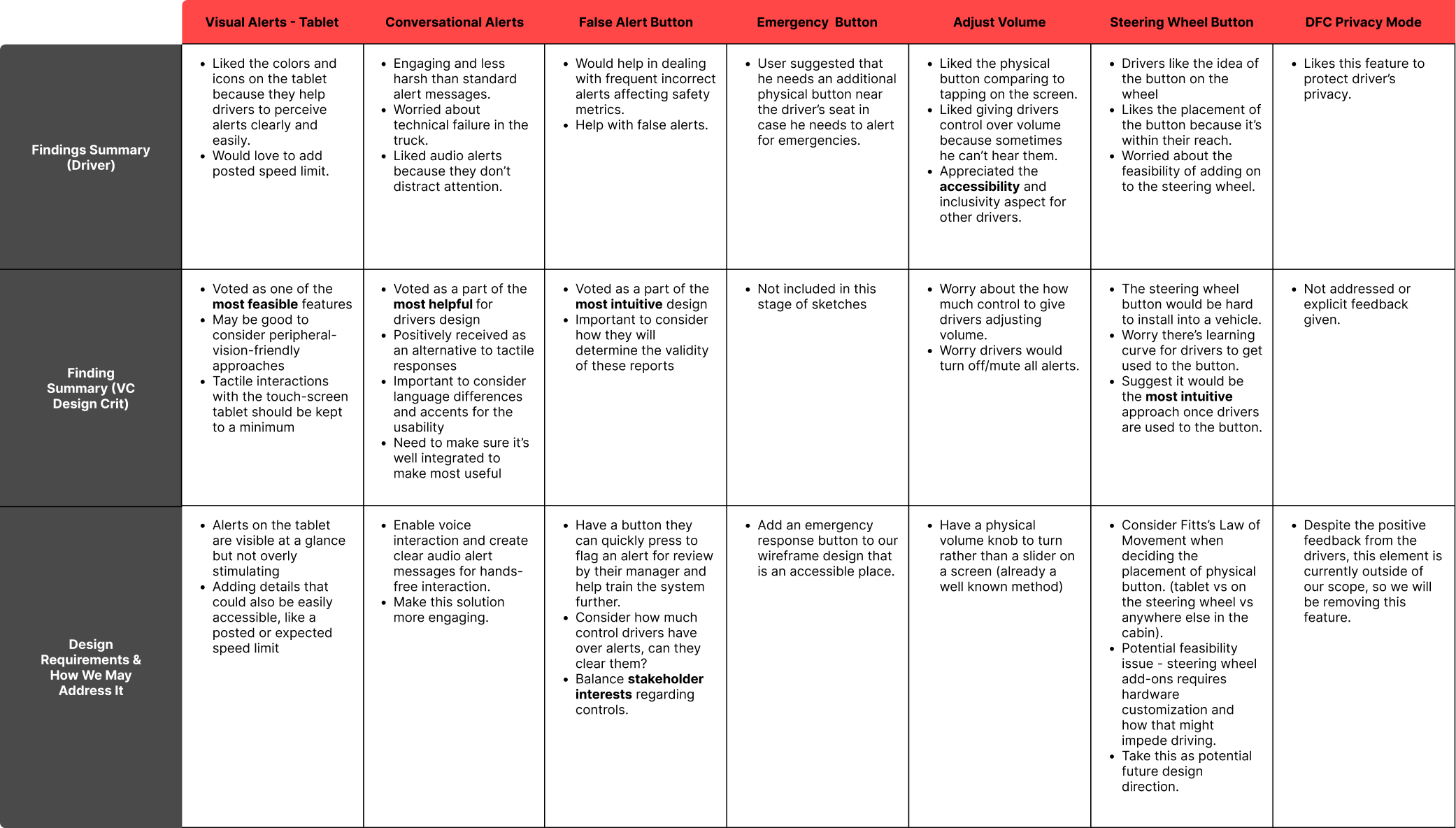
Summary of Findings
- Drivers want a system that doesn’t criticize them but instead helps and provides the appropriate information to address the situation.
- They want to be able to respond to alerts and issues in a quick and intuitive manner. Audio was described as the most useful for drivers but visual alerts most feasible.
- They want to have physical buttons, like an emergency button, rather than have touchscreen controls. Touchscreen controls potentially require more time to locate.
- Keep volume control for hearing enhancements or impairments, but more could be done on the visual counterbalance.
Wireframe Design Requirements From Sketch Feedback
From these findings from our feedback sessions, we derived the revised design directions in preparation for low fidelity iterations.
1.
The system must have representations of physical buttons instead of digital
2.
The system should have an emergency button
3.
The drivers must be able to initiate control and conversation with the system
4.
The system must balance the control drivers have over resolving alerts (e.g. cannot mute)
5.
The system must not have overstimulating visual alerts
Low Fidelity Wireframes
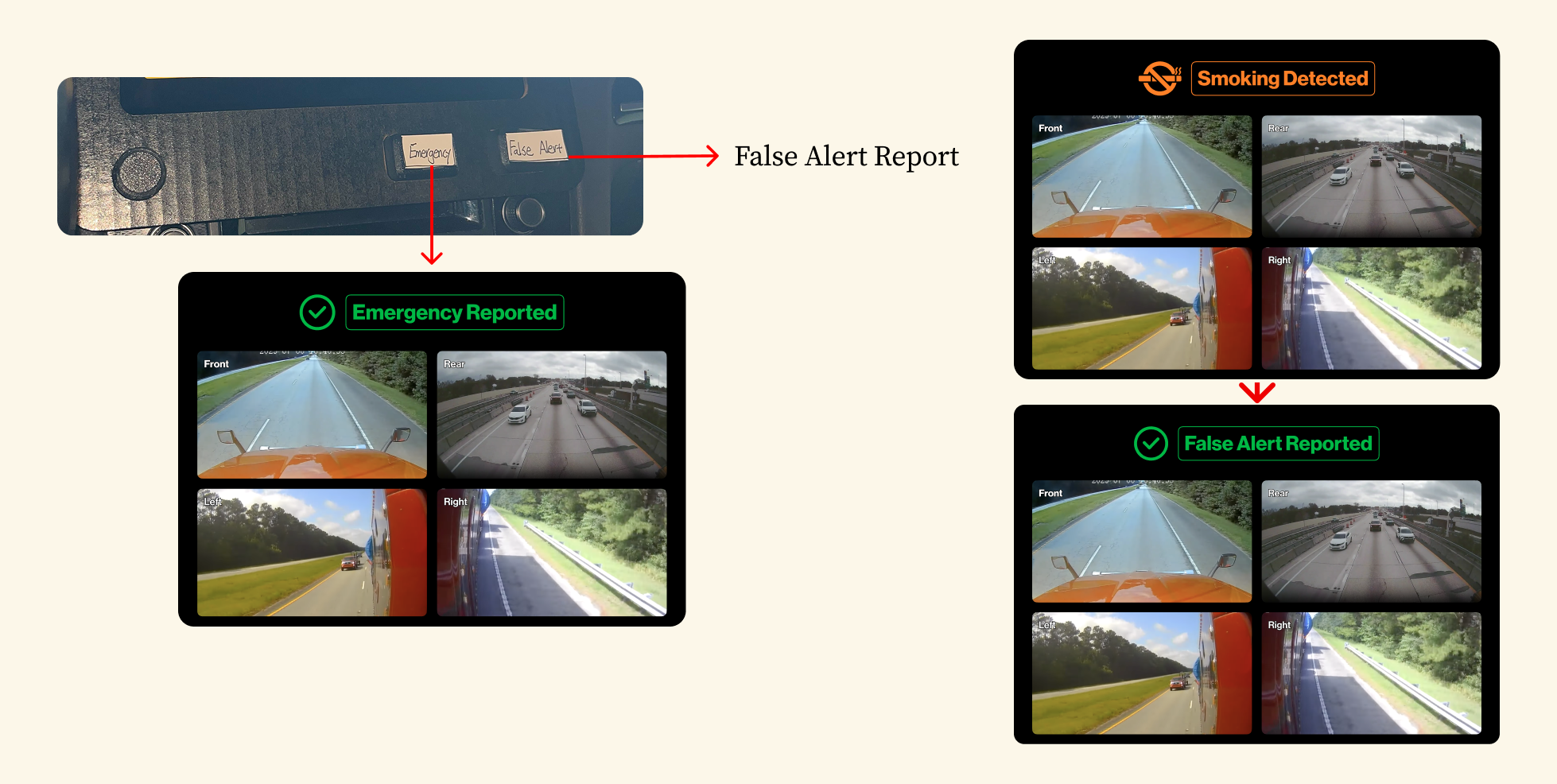
Suggested from the feedback on our sketches, our wireframes combined most of our sketch concepts into a single, physical prototype, which was simulated on Figma (embedded below). There were 3 flows involving dialogue, external alerts, and internal alerts. There are also physical buttons at the button of the tablet: volume control, emergency, false report.
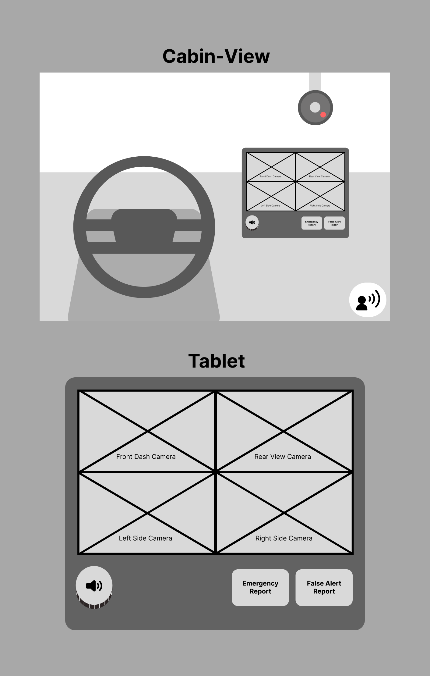
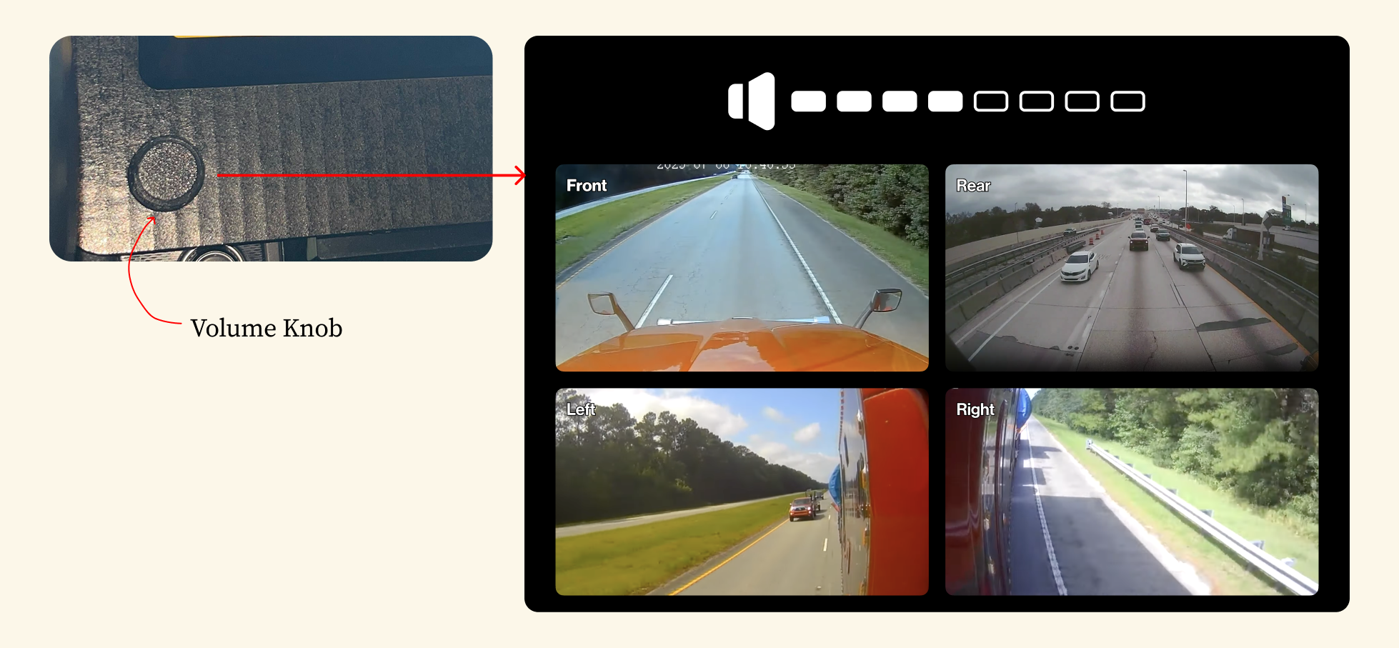
Cabin-View & Tablet
Since we involved digital prototypes, we wanted to create a view that simulates the driver being in the cabin. The cabin-view contains a steering wheel, a camera, and a tablet. The tablet has buttons and knobs at the button, for volume control, emergency reporting, and false alert reporting.
Dialogue Flow - Voice Assistant Only
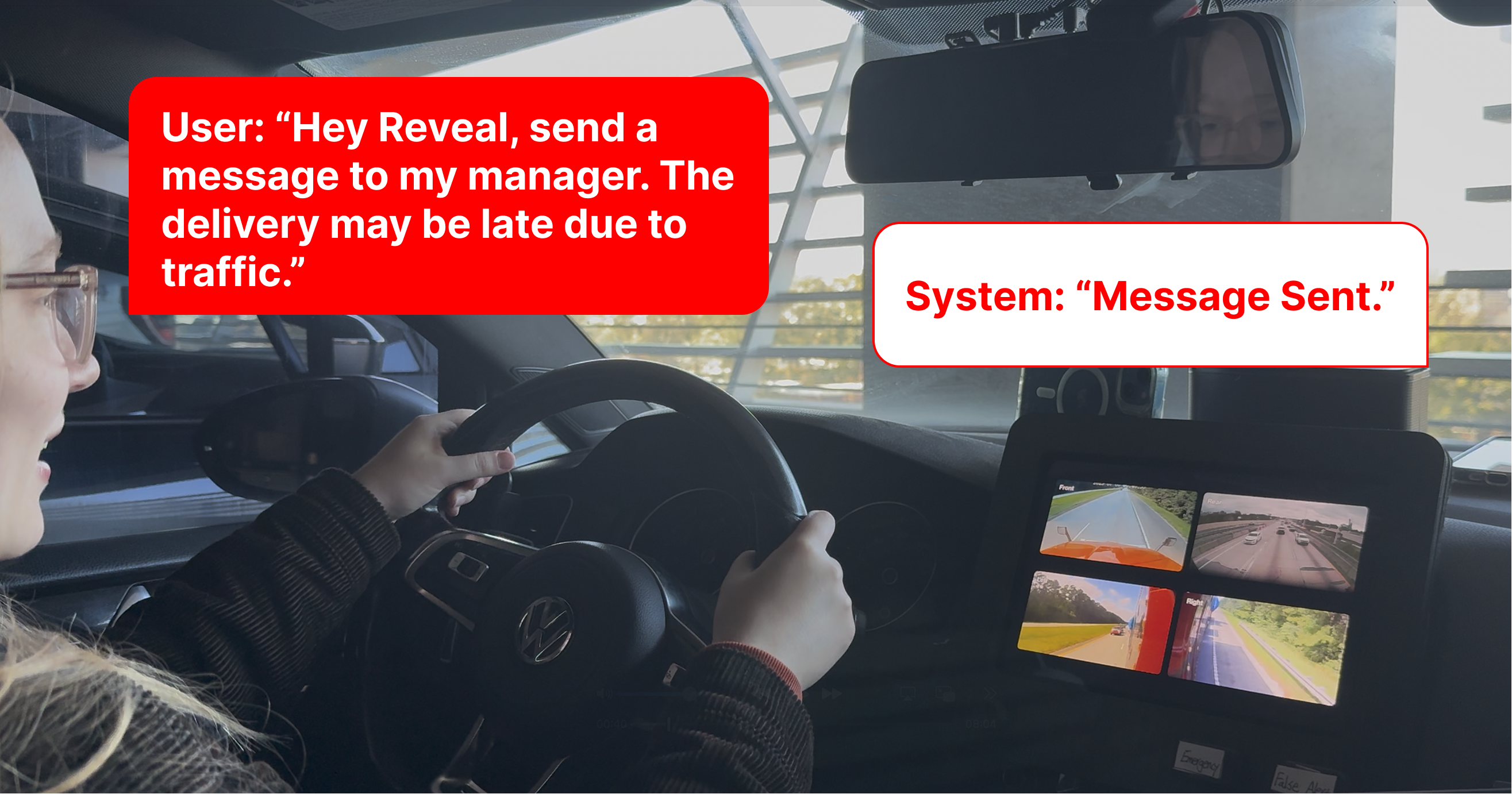
The system, beyond just giving audio alerts, comes with a voice assistant agent, like brainstormed from our sketches. In the first flow, the driver can initiate a conversation, like sending a message to their manager to update them on delays. In the second scenario, when the driver is detected as detected as drowsy, the assistant will provide the warning and also ask if they would like to be rerouted.
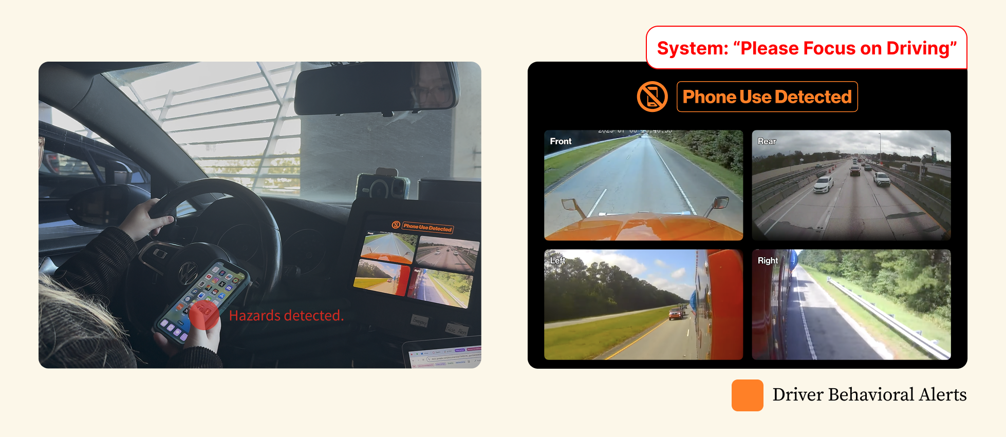
Internal Alerts
When the system flags an alert based on the driver’s behaviors from within the cabin, the alert will display on the tablet screen alongside an audio alert (e.g. smoking detected). We created two versions, where one had the alerts as banners and the other displayed the alert in full-screen. Each type of alert has a unique icon next to the text description.
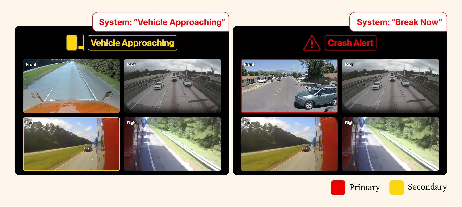
External Alerts
When the driver encounters a hazard from outside, like surrounding traffic or lane departures, the system alerts the user audibly and visually. The camera views affected are also highlighted based on the type of warning.
Figma Prototype of Wireframe
Revisions & Feedback
We recruited three full-time fleet drivers to critique our wireframes. The sessions were facilitated to be similar to our sketch feedback sessions: show-and-tell the flow and then ask them their immediate thoughts and opinions on the idea. We made sure to empasize their thoughts on where the system would succeed and fail based on their experience in the field. What is most helpful and accessible to them, what do they find least helpful, which feature would improve your driving the most, etc.
My role at this step was to create the feedback protocol, lead one of the interviews, note-take for the other sessions, and then help analyze the results for the next stage.
Summary of Findings
- Drivers liked communicating with the voice assistance and utilizing physical buttons for quick and clear responses. Having clear visual alerts in case they cannot hear the alert was also helpful.
- They also want to be able to customize their experience of using the FMS and have additional ways to account for any technical failures.
- They generally most liked the voice assistant, volume control, and the false alert button.
Final Design Requirements
From all of the research thus far and the feedback from our low fidelity wireframes, we revised and finalized our design directions before the final stage of this project.
1.
The system must utilize interactive audio alerts that users are able to initiate voice commands.
2.
The system must have non-intrusive visual alerts while providing intuitive messages.
3.
The system must have physical buttons for quick access.
4.
The system must be customizable for drivers, designs must be accessible for individuals with hearing impairments.
5.
The system must account for technical failures, providing backup solutions to ensure drivers’ safety confidence.
Final Prototype
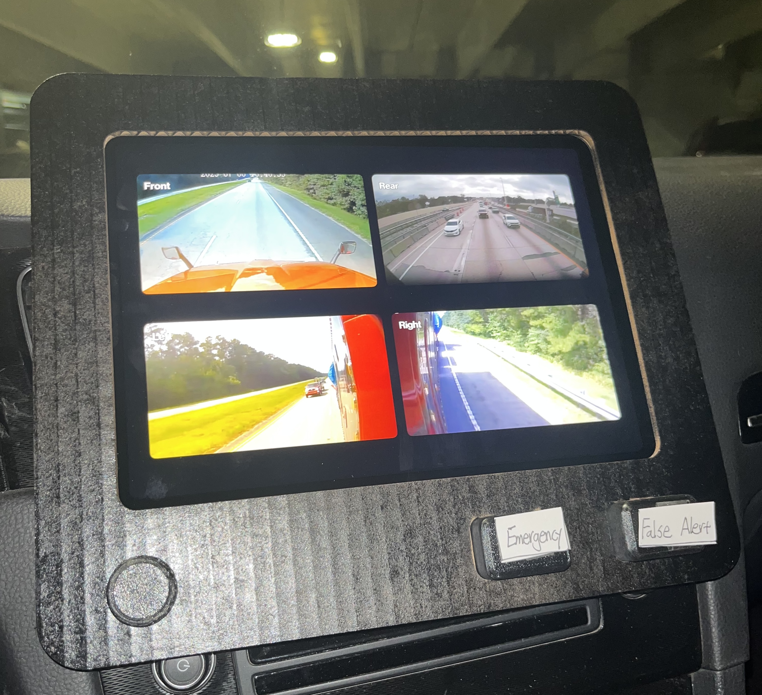
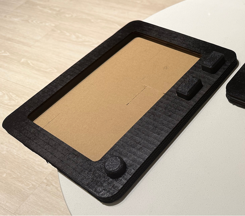
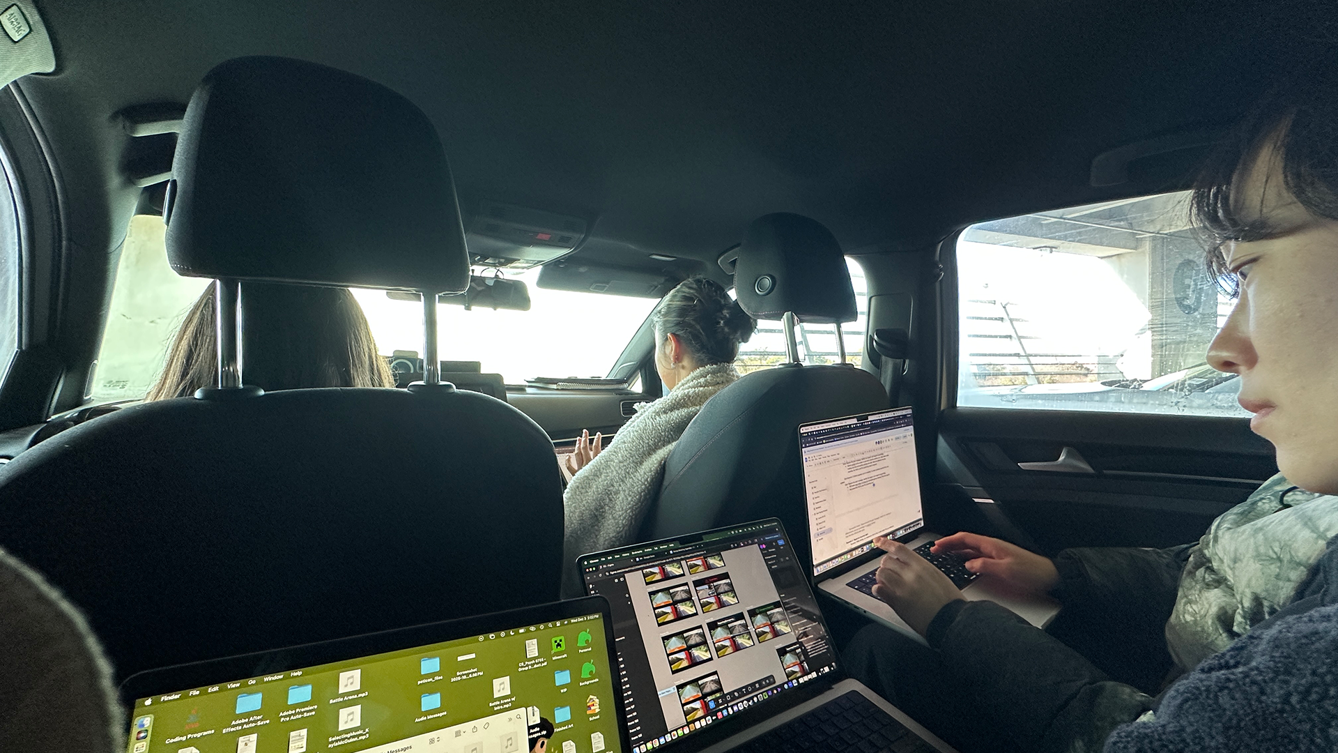
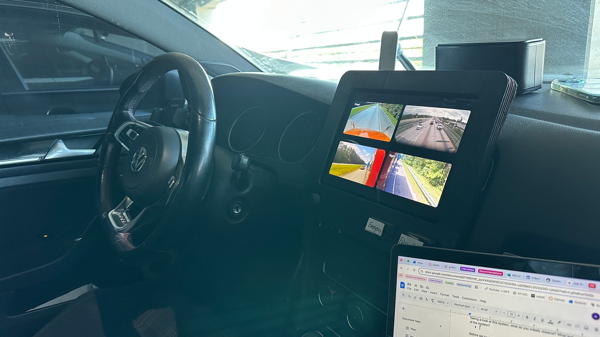
Since we sketched and wireframed for a physical prototype, we got to work on the blueprint for a tablet-based approach to our problem space. My teammate made the CAD for 3D printing, and we stayed in the lab for long hours to assemble the prototype.

How it Works
We created a frame out of firm cardboard and used a laser cutter to create button spaces at the bottom and a center window for an iPad to slide in. The left button is the volume knob and the right two spring-loaded buttons are the emergency and false report buttons. The iPad displays a Figma prototype. From wireframe to this prototype, most of the features remained similar. The frame with the tablet inserted can then be attached to the dashboard of a vehicle.
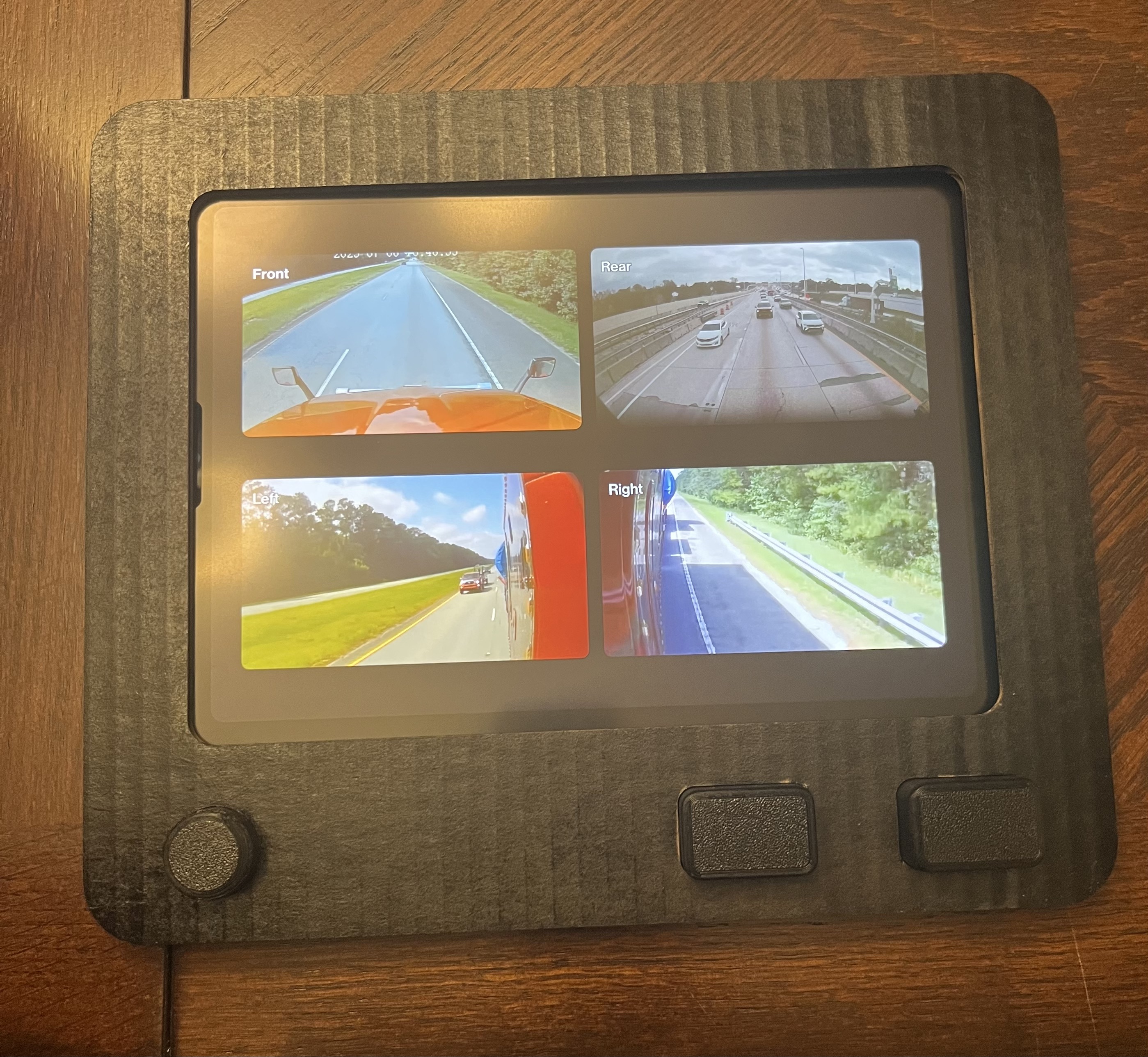
Digital Screen + Physical Buttons + Voice Command
Voice Command
By saying "Hey Reveal", the driver can trigger a conversation with the voice assistant to complete different types of tasks.
- Hands-free Control; no touch needed
- Non-intrusive assistance
- An engaging and easier interaction between drivers and their alert system
Alert Display with Real-time Footage
When an alert is triggered, the message and icon appear as a banner at the top of the screen, above the live camera feeds. An audio message also plays to pair with the visual alert.
- Colors for severity and context, red indicating immediate danger, orange as driver behavioral issues, and yellow for warnings.
- Border around the camera footage most relevant to the alert, if applicable.
Physical Buttons - Volume & Reporting
Physical buttons for drivers to interact with in cases of adjusting volume or reporting false reports or emergencies.
- The volume knob can be turned to change the level up or down but not muted.
- A emergency alert button notified their emergency that something has happened and can trigger a phone call to emergency dispatchers.
- The false alert button reports the previously or currently playing alert that it is faulty, helping to improve the system's detection system while also potentially relieving the driver of incessantly playing alerts.
User Testing
At this final stage of the project, we wanted user feedback on the system. To do so, we developed a testing protocol that was a mix of Wizard of Oz and think-aloud protocol. If unfamiliar with these terms, think of an interactive puppet show where my team were the puppeteers, but the viewer must commentate all thoughts and behaviors as the interact.
During the session, each team member completed different types of roles:
- Facilitator: Interviewed and main point of user contact
- Notetaker: Took notes on user behavior, comments, and interactions
- Figma Controller: Changed the Figma screens in accordance with the users choices and the tasks being presented
- Audio Controller: Played audio in response to the users interactions with the system
I was mainly the Figma Controller and Notetaker during the user testing sessions but jumped in when I had questions I wanted to ask the participant. (I also provided my car as the testing site.)
Participants & Testing Tasks
We had a total of 4 participants. Due to time and resource constraints, our participant requirements were that they were drivers with at least 3+ years of experience, have active driver’s license, and have their own vehicles. Each session took about 45 minutes to complete and they had to complete task-based scenarios to interact with our implemented features.
- Audio Dialogue
- Warnings
- Reporting a false alert
- Adjusting the volume
- Signaling an emergency
Heuristic Evaluations
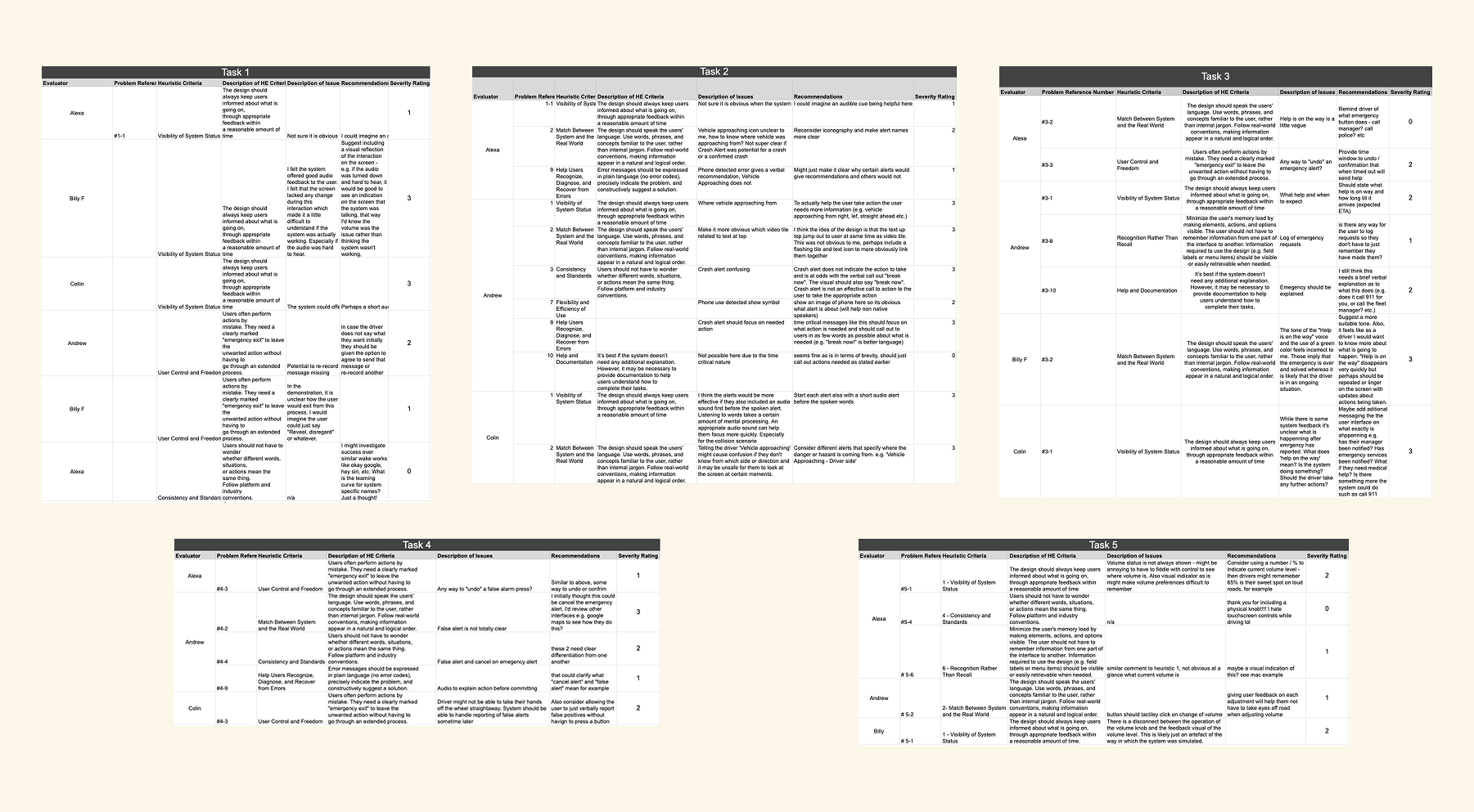
To get some expert views on this prototype, we asked for heuristic evaluations from the team at Verizon of our prototype. We used Jakob Nielson's 10 Heuristics for this evaluation and provided a template before sending it to them to complete remotely.
Doing evaluations on a physical prototype would normally be difficult, but we created a short video of each task for the evaluators to use. With additional set of instuctions and forms to complete, 5 evaluators from the Verizon Connect team gave input on suggestions and places of improvements regarding heuristics. They were instructed to:
- Watch a task video
- Review the heuristics
- Provide a severity rating
- Continue to the next task
Analysis - User Testing & Heuristic Evaluations
After conducting affinity diagramming and thematic analysis, we had 6 central findings.
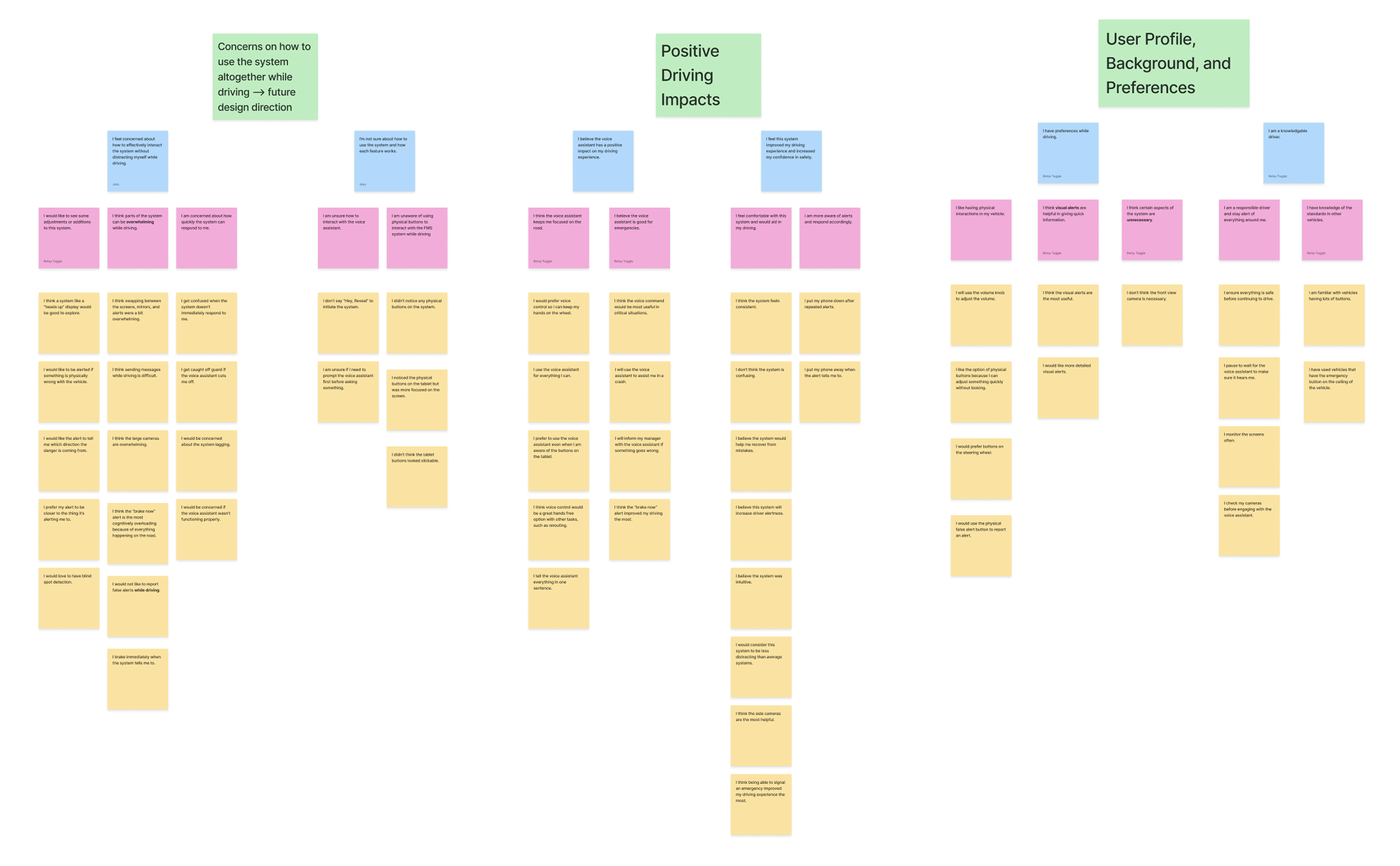
Finding 1
The voice assistant was used the most to accomplish tasks.
- Users chose their voice over physical buttons in the majority of scenarios
- They asked the voice assistant to help with everything
Finding 2
Users are comfortable with the system as long as it does what it says it does.
- Users like the ease of the system but need more feedback on what it’s accomplishing
- Emphasized further in the expert evaluation
Finding 3
Users need more specific and concise alerts.
- Especially with the hazard alerts
- Users want to always know when danger arrives and where it is relative to them
- Visual alerts need to more clearly indicate the danger position
- Need to update any vague wording or incorporate small sounds in front of the alerts before they speak
Finding 4
Visual alerts were a very important indicator for drivers.
- Users always associated the visual alerts on the tablet with the sounds.
- One user pointed out how important it was for them to have visual alerts for accessibility since they are hard of hearing.
Finding 5
Buttons need to be more visible.
- Users either would not even see the buttons or “did not think they were interactable”.
Finding 6
Most users feel the most secure when their hands are kept on the steering wheel.
- Users who opted to not use the buttons stated that they preferred to keep their hands on the wheel and not have to look away from the road.
- Users mentioned the preference of steering wheel buttons they use in their own vehicles.
Next Steps
If the project were to be continued, we would explore the following next steps and design recommendations.
- User Testing: Test with long-haul drivers and older users, expand the testing pool to include diverse participant characteristics
- Tactile Interaction: Change the color of the physical buttons to make them more noticeable.
- Alerts: Update the alerts to be more detailed but specific. For instance, indicate where the vehicle is approaching for the “vehicle approaching” alert, but organized to be at the beginning so drivers can react to the information. Finding the balance between audio and visual alerts
- Expand capabilities of the voice assistant: For the voice assistant, make it smarter by repeating and confirming user commands to provide more feedback and allow users to recover from errors. It should also be designed to be more adaptive in order to respond to diverse commands in a timely manner.
- Button placement: Move the emergency button and cover it to prevent accidental triggering.
Last Thoughts
I had an absolute delight working with the Verizon Connect team and my colleagues. This project was one of the first times I developed a physical prototype, and I learned a lot about designing within 3D spaces and preparing users for situational awareness scenarios. Balancing stakeholder values was also crucial to the outcome of this project, and I believe we did that very well given the time and resource constraints. Getting feedback from real users and experts at every stage of the project was especially helpful to get diverse perspectives on design directions.
During our final presentations in front of the Verizon Connect team, they assured us that the work we accomplished would actively help them in some of the current work that they were pursuing. Having that kind of impact on the fleet management industry is very rewarding, and I appreciate all of the guidance from mentors and peers to reach this point.
Thanks for reading! Don’t hesitate to reach out if you have any questions!