Timeline: Februrary - March 2021 (6 weeks)
Design Tools: Figma, Invision
Group: Yada Chuengsatiansup, Daniel Wang, Angela Quiambao, Audrey Zhao
Roles: Designer, Interviewer
Summary
As a group of four, my team decided to study and tackle the problem of misinformation on social media. We analyzed online discussions, user interviews, and competitive analyses about misinformation on social media. We decided to target Twitter and designed Twitter features that promoted discussion and fact-checking.
Background
Have you ever scrolled through social media to get the latest news? It’s likely that at some point, you came across some kind of misinformation. When you come across such a case, do you always fact-check or see opposing viewpoints? Chances are, you don’t. These instances could be worrying as misinformation that goes unchecked can affect your opinions and future decisions.
To address the ethical digital world, my team decided to target the rampant misinformation that plagues social media today. We investigated the backgrounds and issues that cause the spread of misinformation between the users of social media platforms in order to identify key areas of redesign.
So what's the Problem?
Social media is a great way to access news and information in real-time, but it could come with the risk of misinformation and inability to escape echo chambers and previous viewpoints.
What is Misinformation Exactly?
Misinformation involves false information with a possible intent to deceive. And the reality is, it constantly exists around us, especially on social media. Sounds scary, right?
So my team made a goal: we wanted to design a feature that could possibly dissuade misinformation while promoting discussion.
Discovering User Pain Points on Misinformation
We wanted to go into the "online field" to observe insights on how people deal with misinformation online. We first went to online platforms, like Reddit threads r/QAnonCasualties, r/technology, and r/Keep_Track, to see what others had observed and debated. We read about personal stories and debates on how misinformation on social media affects those around us. From these posts, we discerned that misinformation can influence people's political opinions and morals depending on the amount of misinformation regulation. From online resources, we observed that different online communities that discuss misinformation have different methods of sharing and debating information.
- On platforms like Facebook, Reddit, Twitter, and YouTube, users mostly interact under posts and comments, which often involve statements, arguments, and/or references to sources. These communities also have varying degrees of interaction around discussing and debating misinformation, where likes/votes/replies often indicate their agreement/disagreement with certain comments.
- Fact checking is often a community effort between the users. Although some platforms attempt to fact check and flag posts, these interventions does not seem to receive as much attention from the users. Instead, the topic of dissuading and regulating misinformation often go to the platform's ethics and responsibilities.
Competitive Analysis: Social Media
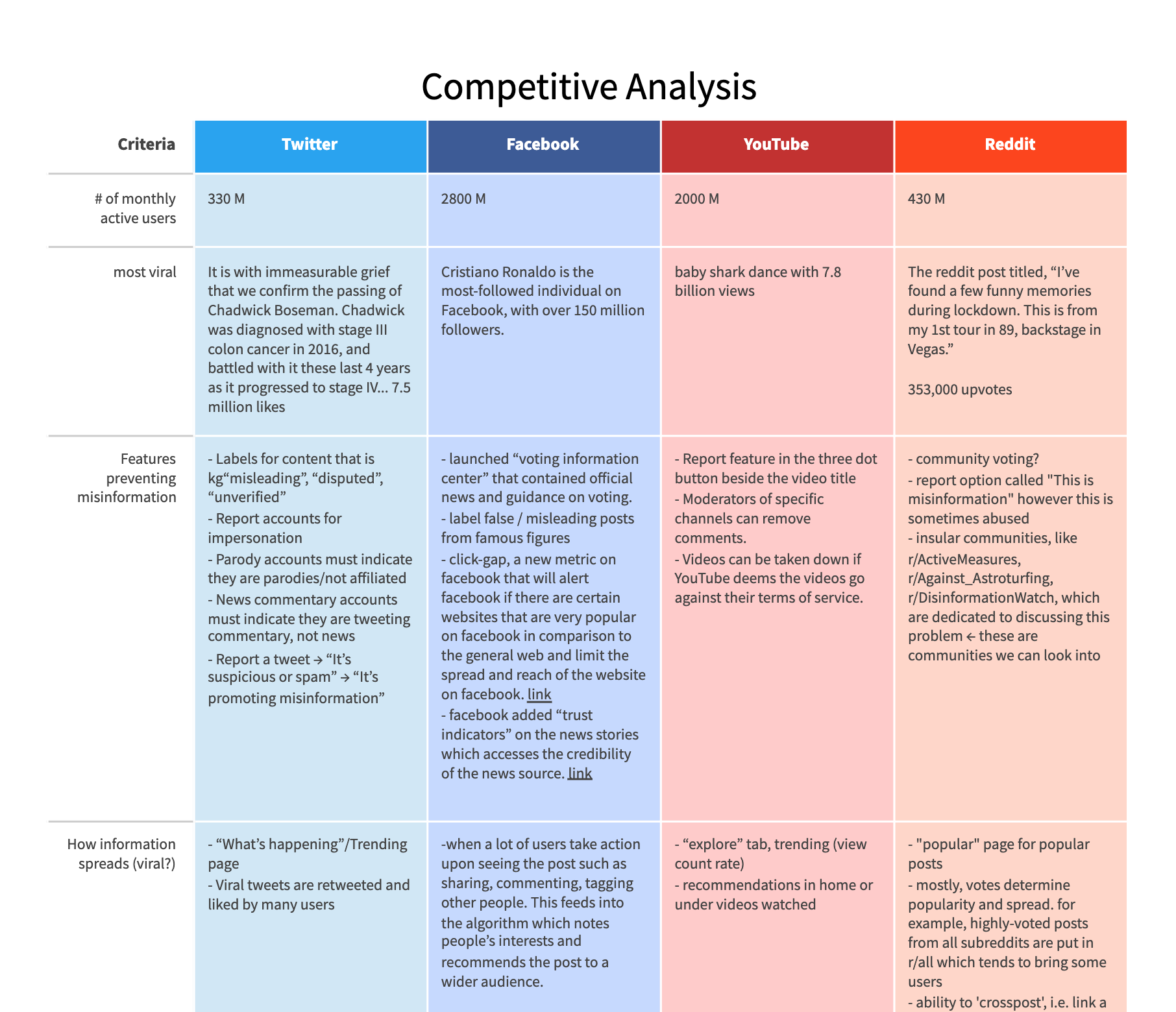
A small snippet of our competitive analysis matrix!
Next, we looked to different social media platforms, Twitter, Facebook, YouTube, and Reddit, by studying their characteristics and handling of misinformation.
My team compiled a list of features from these platforms that are useful for preventing misinformation. This list includes how these platforms label/flag misleading content, placetrust indicators to assess credibility of news sources, and report posts/pages that spread misinformation. We have also identified significant gaps across these platforms: encouragement of echo chambers through the lack of diverse content through the recommendation system, limited user control and freedom regarding recommended posts on their feed, and weak enforcement of policies.
Interviews on Misinformation
To gain more user input, we interviewed four social media users about their opinions and habits when it comes to online misinformation. We asked about their habits on gathering information through social media and their opinions on misinformation.
There are a few key insights into user behavior that can be noted from the interviews:
- Users mostly consume content through recommendation systems (as opposed to active search).
- Users generally do not take actions to try and modify their feed. They will only do so through subscriptions and consuming content they prefer but do not usually spend a lot of effort to remove content they don’t like.
- Most users do not fact check unless they highly suspect that they have been misinformed.
- Users find it hard to tell if they have been misinformed or not.
- Some users will also consume news directly through news media (CNN, Guardian, etc).
Personas
Based on our research and interviews, we created two personas to help guide our understanding of the intended audience and their needs. We highlighted their specfic needs and frustrations when it comes to dealing with online misinformation.
Chad
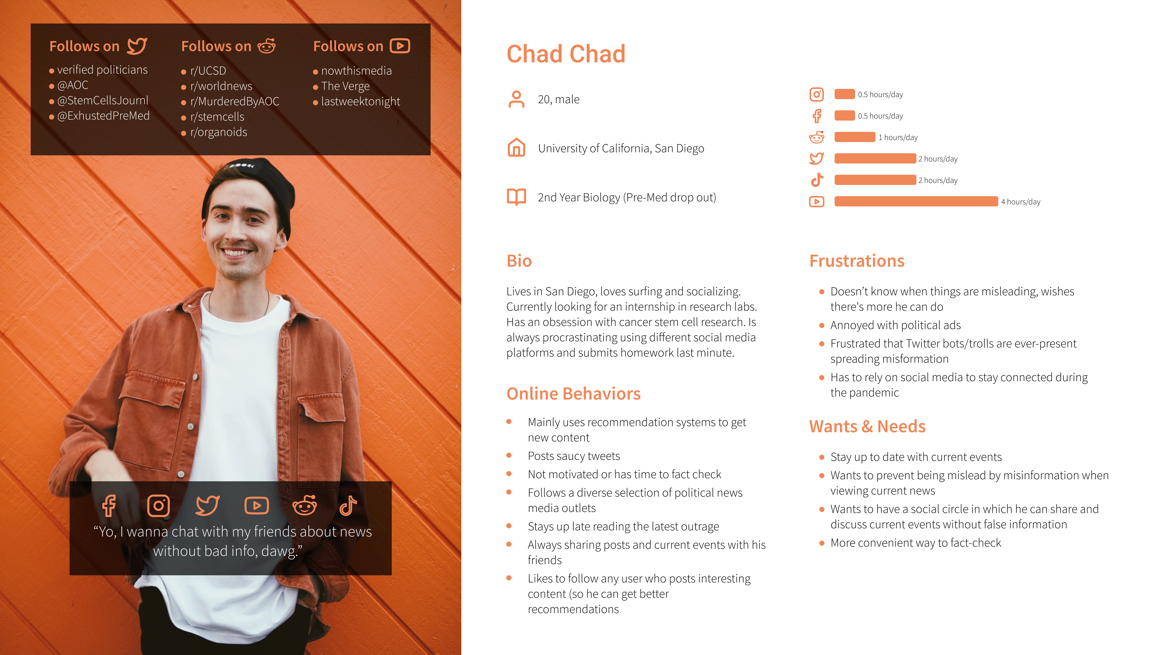
Our first persona, Chad, typically relies on the recommendation systems of his social media platforms to get content and news. However, he feels that it’s sometimes hard to distinguish between real and false information when scrolling through his feed. He’s afraid that he may accidentally believe misinformation and bring it into his social circles. Therefore, he wants to find a way to minimize exposure to misinformation and maximize ways to fact-check.
Claire
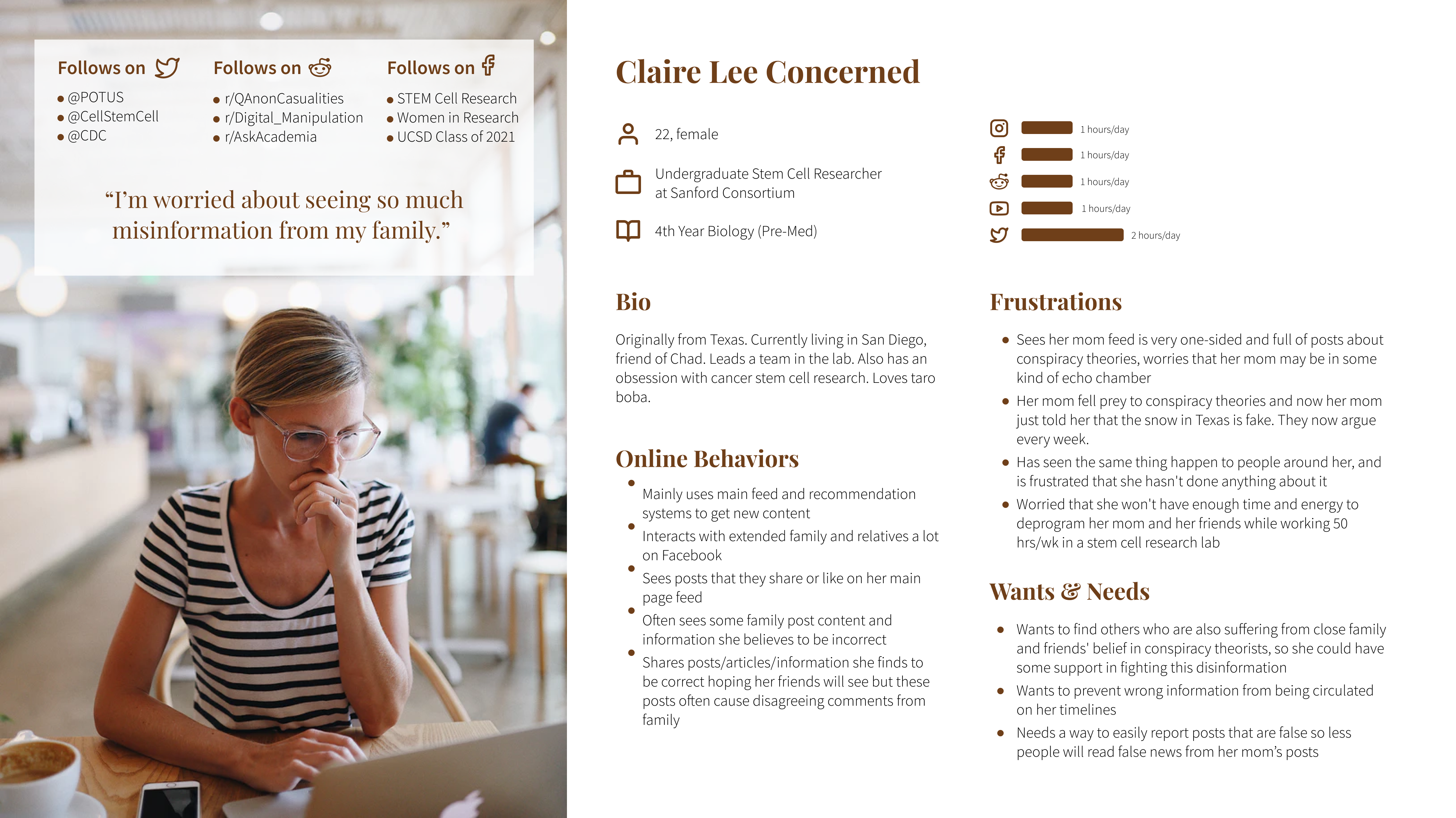
Our second persona, Claire, is Chad's friend from the same major. Unlike Chad, she is not worried about her own ability to identify misinformation. Instead, her main concerns and needs around misinformation stem from her family members, who are victims of misinformation on social media. Their online behaviors often cause tension in the family as Claire tries to fact-check any misinformation they spread on their social media. She wants a way that prevents others from being easily influenced by misinformation.
Mission Statement
After getting a good understanding of the subject of misinformation, we decided on specific platform to target: Twitter. We decided on the Twitter platform, because we recognized that Twitter was a popular app for sharing news and opinions. We also drew inspiration from some of Twitter's current features that flag disputed Tweets, and we wanted to expand on it.
Our goal is to reduce the spread of misinformation via a redesigned Twitter interface that:
With our research, personas, and mission statement in mind, we moved to InVision and Figma to create prototypes for a new anti-misinformation feature for Twitter.
Brainstorming: Where the Ideas Started
We moved to InVision to sketch out some ideas to help inspire and motivate our future designs. We studied the current layout of Twitter’s feed, and created some storyboards and wireframes to brainstorm a feature to combat misinformation.
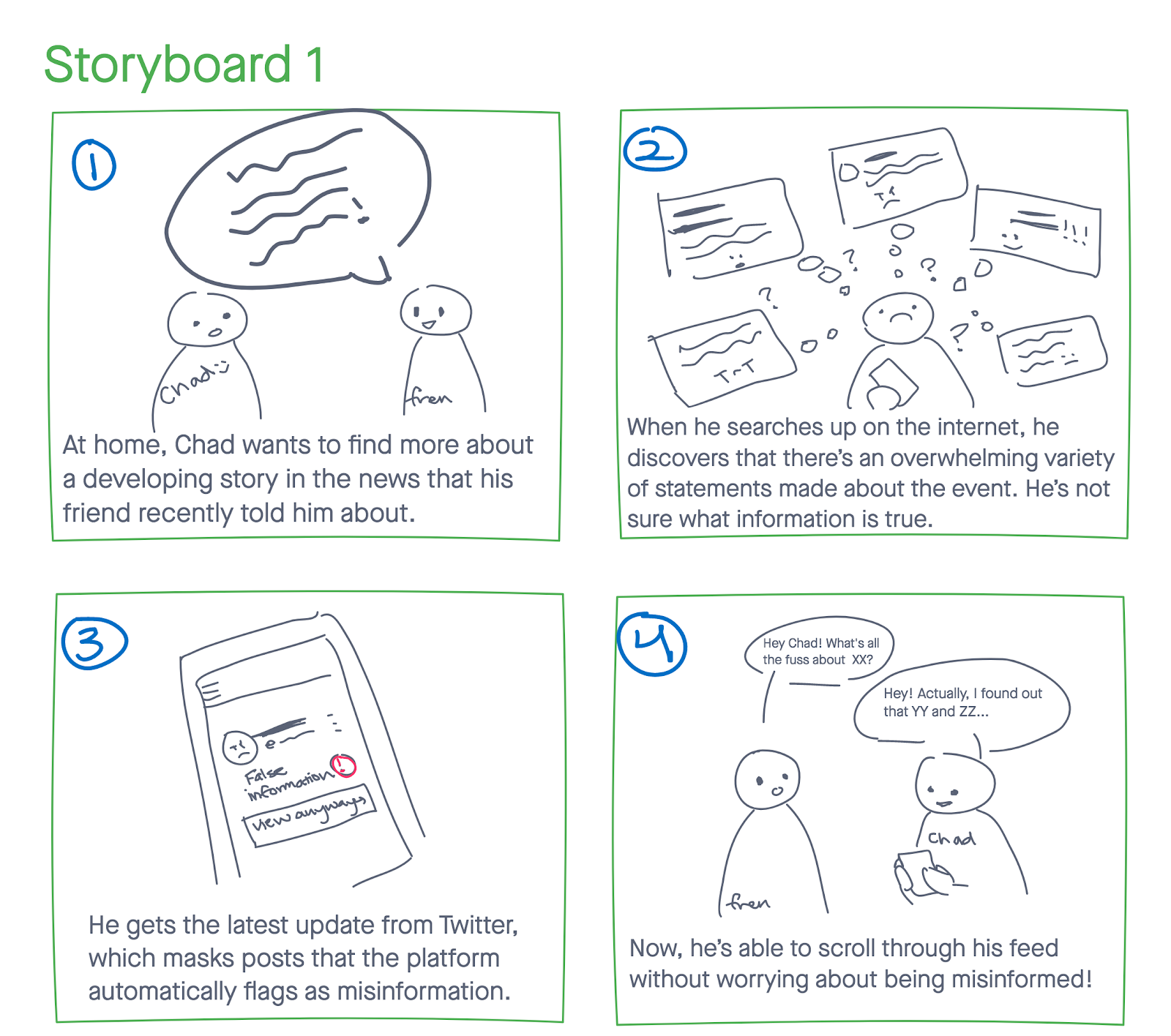 One of the Storyboards: Masked Misinformation
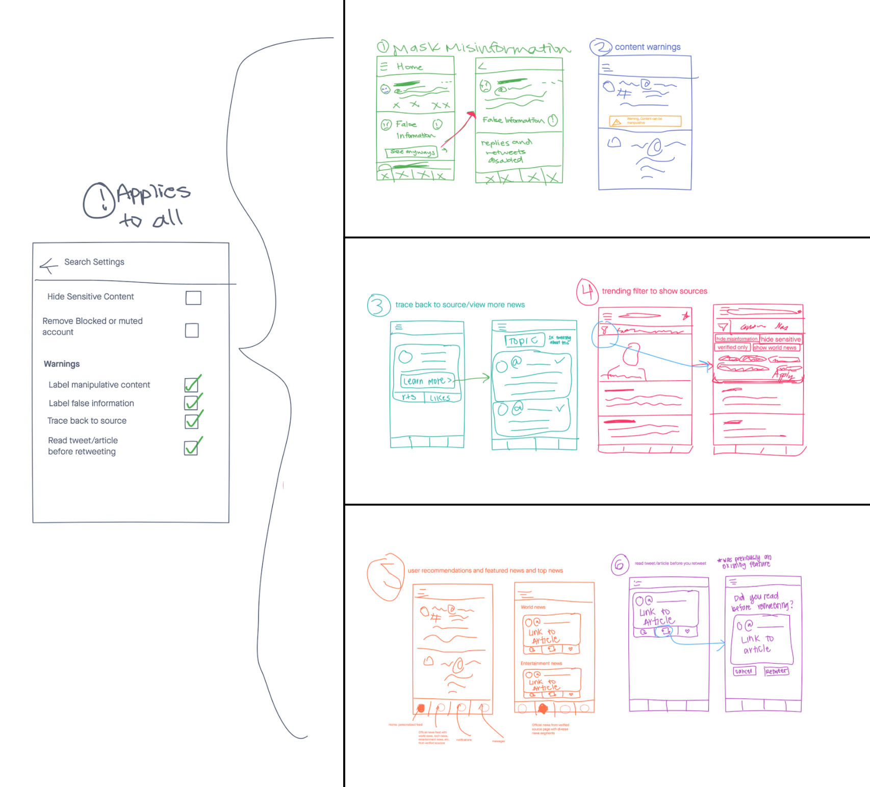 Sketches: Brainstorming Different Ideas
Low-Fidelity Prototypes: Different Paths
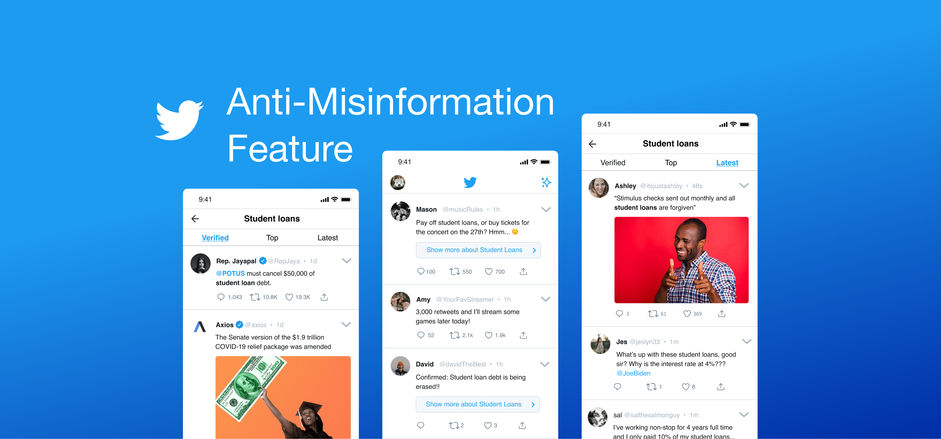
With a few ideas laid out, we gained some feedback from our peers about which layout was the best and most intuitive to Twitter’s current platform. My team took this feedback and settled on a specfic feature: a button on a tweet that takes the user to a dynamically generated page based on the main topic of the original tweet. The page would be divided into three separate categories the user can sort by. Once we narrowed down to that idea, we moved to Figma to create some low fidelity prototypes. The prototypes below show the "Topic" page generated. The main example topic is on student loans.
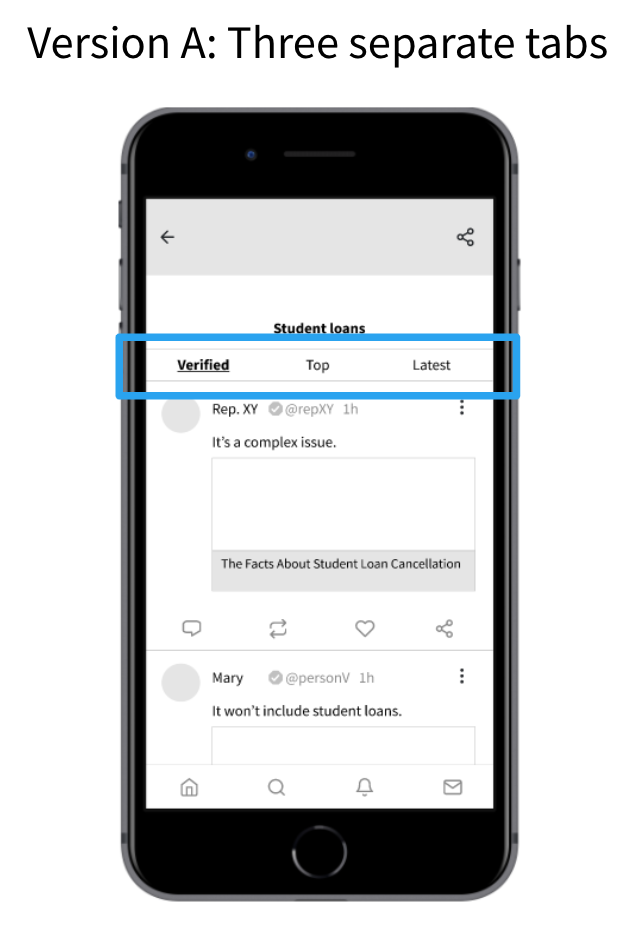
Version A
This version places the three tabs (Verified, Top, and Latest) near the top of the topic page. When the user clicks on a specific tab, the page slides over to that tab's filtered tweets.
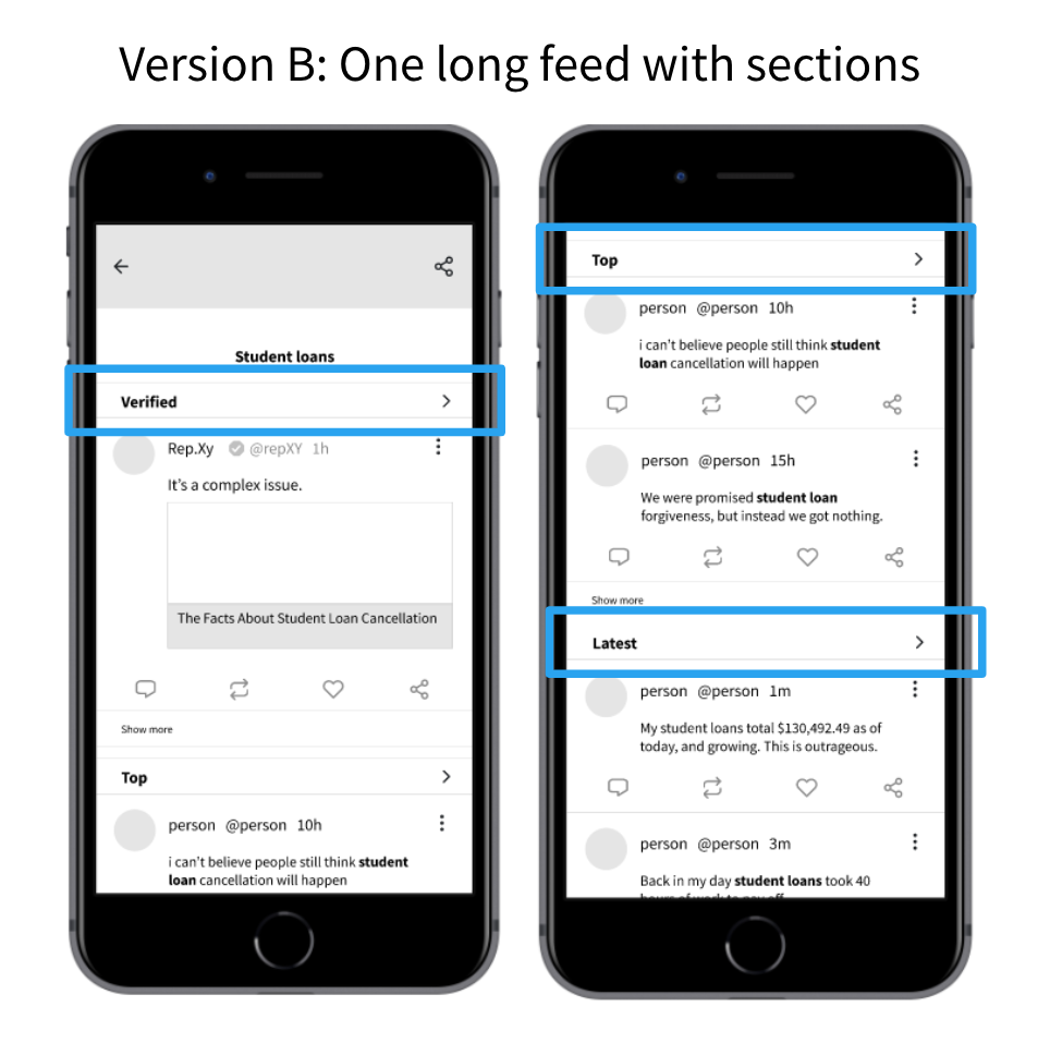
Version B
This version vertically separates the three tabs (Verified, Top, and Latest). The user would need to scroll down to access all of the different tabs. When they click on a tab, the app would take the user to a new page dedicated to that tab filter.
Lo-Fi User Testing
We conducted user tests with some of our peers. We tested two groups - one tested Version A and the other tested Version B. For both groups, we asked them speak aloud their thought as they try to reach some goal we assign them.
Once we gathered and analyzed the user feedback, we decided that Version A was the most intuitive. Version B's tabs, although the text is the same size as Version A's tabs, seemed to be easily missed. Version A has all of the tabs at the top, and users seem to be accustomed to accessing features at the top or default state of the page.
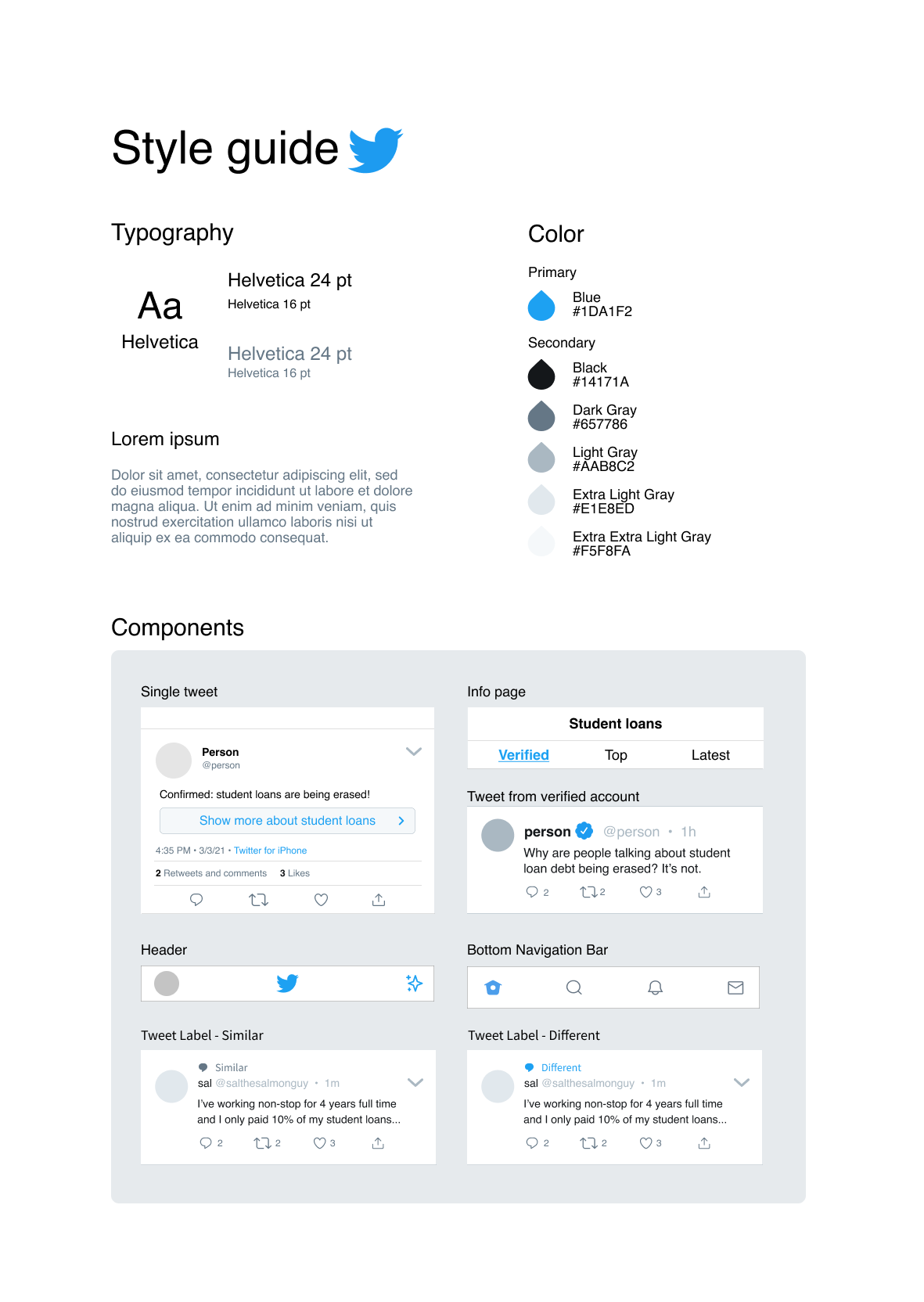
Style Guide Based on Twitter's Platform
Before we created the next prototypes, we created a style guide to help us keep consistency between our design and Twitter's current platform.
The top half of our guide display the font, font size, and hex colors that are used on Twitter.
The bottom half shows the commonly found components in our design. The component titled "Single tweet" displays the button that would be attached below the content of the tweet.
High-Fidelity Prototype
At this stage, we utilized Figma's design and prototype features to construct a high fidelity prototype. We applied the components, colors, fonts, and stlyes from the style guide to this prototype in a way that it looks similar to Twitter's current layout.
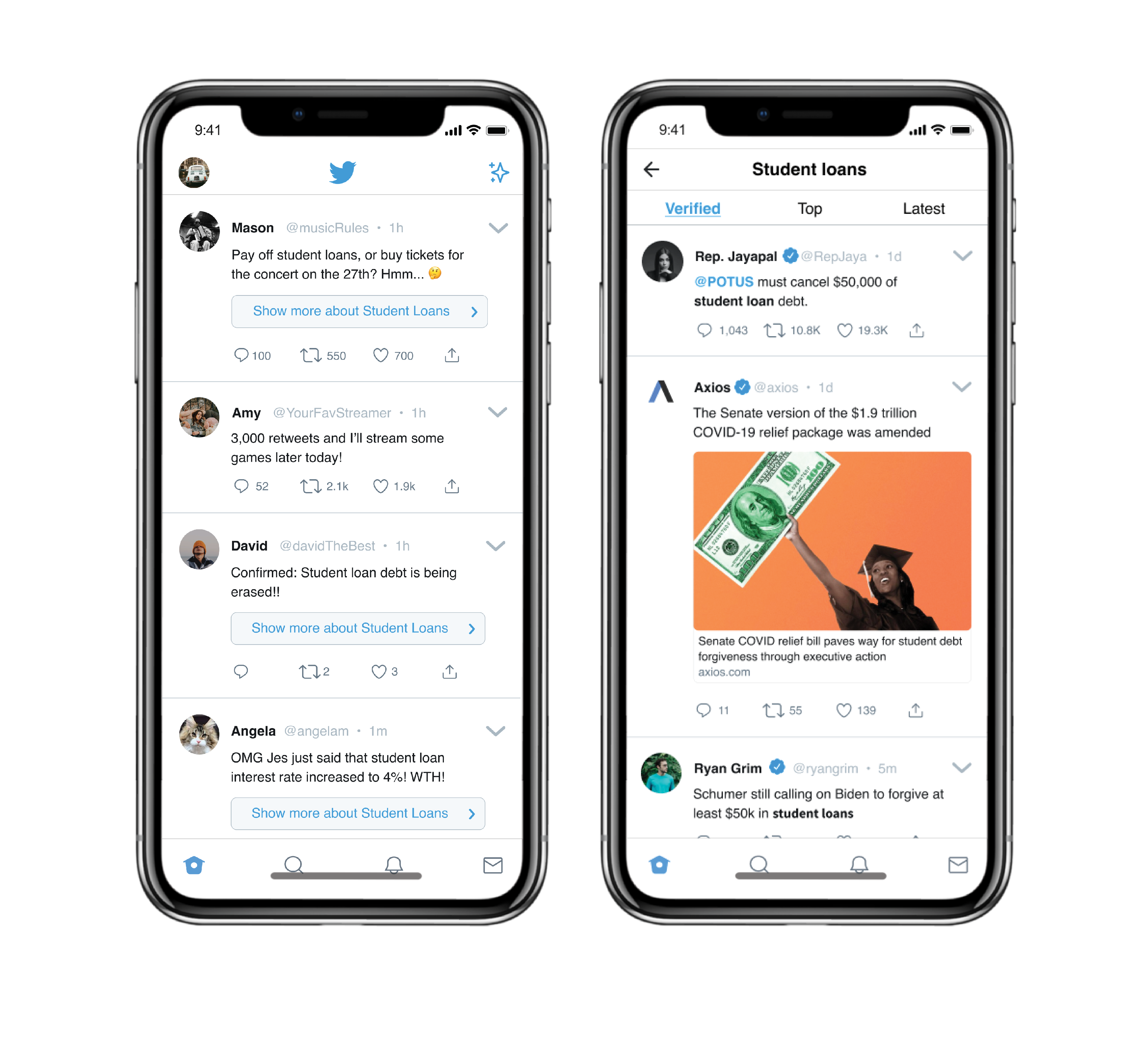
This prototype allows users to explore a feed generated by the topic of the original tweet. The user is exposed to varying viewpoints and allows them to find more information, discussion, and fact-checking so that they are less likely to be misinformed.
The "Show more about Student Loans" text in the button located below the tweet content was given a blue color so that the feature stands out to the user. In theory, we want the user to utulize this feature as much as possible, so they can learn more about the content on their feed. By seeing opposing, similar, and verified news, users are likely to depend on discussion and fact-checking to gather their information.
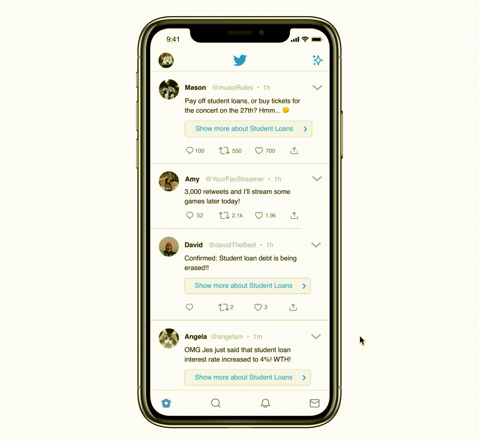
Hi-Fi User Testing
Once the colorized prototype was finalized, we conducted a few user tests to see how users would use the new feature to gather information about the original tweet and topic. We observed several things. The show more button is useful, because it provided easy access to verifiable information needed for fact-checking tweets. Every user was able to fact-check or find discussion around certain tweets on their main feed using our prototype. They primarily used the Verified tab to fact-check tweets.
From our results, we made a few considerations towards the next iteration.
- We noticed that users are unable to immediately recall different opinions as they said there were too many tweets and they did not pay attention to how the tweets differ from each other. Thus, we decided to add similar/different tags in order to help the users visually categorize different arguments. A "simliar" tag tells the user that the tweet contains a similar viewpoint to the original tweet, and vice versan for the different tag.
- Some users gave the suggestion that the first information users are shown should be the most relevant and (close to) factually correct. Therefore, we rearranged the order of the tweets to be so.
- Some users mentioned that the “Show more about [topic]” button might feel cluttered or stand out too much. However, ideally a regular Twitter user would have a more varied timeline where not all tweets would all be focused around a singular topic. Therefore, we chose to maintain the same design for our “Show more” button.
Final Version
And the finale! Based on all of our research, interviews, and iterations, we constructed this final prototype. The "Show more about [topic]" button has shown to help users find the information that is verified and discussed.
And, we added the similar and different tags mentioned earlier. They can be seen in the GIF to the right.
Below is our final Figma prototype! Feel free to explore it.
The End
In this project, I dug deep into the design process as a whole. I learned how to effectively use Figma's prototype, design, and collaborative tools. I conducted meaningful user research and interviews that contributed to our designs. And lastly, my team and I completed our mission by creating this "Show more" feature that deemphasizes interaction with misinformation in users' feeds, discourages echo chambers, and incentivizes fact-checking.
And that's the end! I really enjoyed working on this project with my team. Please let me know if you have any questions!